
Improving your e-commerce conversion rate is more than just tweaking a number—it’s about transforming casual browsers into loyal customers. Think of it as the ultimate health check for your online store, showing you exactly how well your marketing, design, and products are connecting with shoppers.
A high conversion rate means you’re delivering a smooth, persuasive experience that just works. A low one is a red flag signaling friction in the customer journey, meaning you’re leaving money on the table. Focusing on conversion isn’t about spending more on ads; it’s about making every visitor you already have more valuable. That’s the secret to sustainable growth.
Why Your Optimization Strategies are so Important
Your conversion rate tells a powerful story. It reveals how well your marketing, website design, and product lineup actually connect with what your customers want.
A high conversion rate? That means you’re delivering a smooth, persuasive experience that just works. But a low one is a red flag. It signals that something in the customer journey is causing friction, and you’re almost certainly leaving money on the table.
When you focus on improving your conversion rate, you get a compounding return on your investment. Instead of just burning more cash on ads to attract more traffic, you’re making every visitor you already have more valuable. That kind of efficiency is the secret to sustainable growth.
Setting Realistic E-commerce Conversion Rate Benchmarks
It’s easy to get caught up chasing some universal “good” conversion rate, but the truth is, it’s a lot more nuanced than that. Performance varies wildly depending on your industry, the price of your products, and where your traffic is coming from. Obsessing over a generic benchmark can be seriously misleading and frustrating.
The real goal should be to establish a baseline for your store and then focus on making small, steady improvements. A shop selling high-end, custom furniture will naturally have a lower conversion rate than one selling everyday pet supplies. The buying decision is just longer and requires more thought.
Your conversion rate isn’t just a metric to stick in a report; it’s a diagnostic tool. It shows you exactly where your customer journey is breaking down, giving you a clear roadmap for what to fix first.
Understanding Industry Averages
To set practical goals, it helps to know where you stand compared to your peers. Here’s a quick look at how different sectors typically perform.
E-commerce Conversion Rate Benchmarks by Industry
This table offers a quick reference for average conversion rates across different e-commerce sectors. Use it to gauge your performance and set more realistic goals for your business.
|
Industry Sector |
Average Conversion Rate (%) |
|
Fashion, Accessories & Apparel |
1.90% |
|
Pet Care |
2.32% |
|
Baby & Child |
2.30% |
|
Food & Beverage |
3.58% |
|
Home & Furniture |
1.55% |
As you can see, context is everything. A store in the fashion space, which includes everything from jewelry to shoes, typically sees a conversion rate of around 1.9%. Meanwhile, industries like pet care and baby products hover a bit higher at 2.32% and 2.3%, respectively. These benchmarks are critical for understanding where you fit in. You can find more detailed stats on e-commerce conversion rates by industry on speedcommerce.com.
Here’s a simple breakdown of why these differences exist:
- Fashion, Accessories & Apparel: These sectors often see lower rates. Why? The competition is fierce, and shoppers tend to browse a lot more before committing to a purchase.
- Food & Beverage: This industry usually enjoys higher conversion rates because the purchases are often need-based or recurring. People know what they want and buy it regularly.
- Home & Furniture: This is where you’ll see some of the lowest rates. These are high-ticket items that demand more research and consideration from buyers.
This context is vital. Bumping your conversion rate from 1.2% to 1.5% in the luxury furniture space could be a massive win. But that same rate in the food and beverage industry might signal an urgent problem that needs fixing. By understanding these nuances, you can stop chasing generic advice and start making changes that produce real, measurable growth for your unique business.
Build a Digital Storefront That Earns Trust Instantly
Your website is your handshake, your storefront, and your best salesperson, all rolled into one. Customers form an opinion in milliseconds, and that first impression is almost entirely driven by design. A clunky, slow, or shady-looking site sends shoppers scrambling to your competitors before they even see what you’re selling.
online shopping
The bedrock of a high-converting storefront is trust. Without it, even the best products at the lowest prices won’t convince someone to hand over their credit card details. This trust-building exercise starts the second a visitor lands on your page, and it’s a mix of speed, clarity, and social proof.
For anyone just starting out, getting this foundation right is non-negotiable. Understanding how to create an online store with these principles baked in from day one is what separates the winners from the wannabes.
Speed Is Your Unspoken Promise
Nothing—and I mean nothing—kills conversions faster than a slow website. Today’s shoppers have zero patience. Research consistently shows that even a one-second delay in page load time can cause a massive drop in sales. Think of speed as the ultimate sign of respect for your customer’s time.
A snappy site feels professional and reliable. A slow one feels broken and untrustworthy. It’s a subconscious cue that can make or break a sale before it even begins.
Here are the usual suspects behind slow load times and how to tackle them:
- Bloated, high-resolution images: These are the number one offender. Use image compression tools to slash file sizes without wrecking visual quality. Your product photos can still look sharp at a fraction of their original weight.
- Too many apps and plugins: Every plugin you add injects more code, which can bog down your site. Do a regular audit of your apps and get rid of anything that isn’t directly adding value to your bottom line.
- Inefficient code or themes: Not all website themes are built the same. Opt for a lightweight, mobile-first theme that’s already optimized for performance.
Show, Don’t Just Tell with Social Proof
When a potential customer is on the fence, they don’t want to hear from you—they want to hear from people just like them. That’s the magic of social proof. It’s the digital version of seeing a packed restaurant; it signals that this place is worth checking out.
Showcasing what other customers think is one of the most powerful ways of improving e-commerce conversion rates. You’re essentially letting your happy customers do the trust-building for you. Real, authentic reviews, testimonials, and user-generated content are perfect for calming anxieties and validating a buyer’s decision.
A study by the Baymard Institute found that 95% of users rely on reviews to evaluate a product. If you’re not putting them front and center, you’re ignoring one of the most powerful tools you have.
Weave social proof naturally across your entire site:
- Product Pages: Put star ratings and a few key reviews right under the product title.
- Homepage: Feature a carousel of your best testimonials or photos from happy customers.
- Checkout: Add a small snippet like “Join 10,000+ happy customers!” to offer that last little nudge of reassurance.
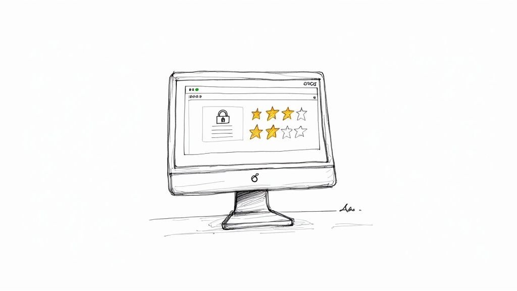
Communicate Value and Security Clearly
From the moment someone lands on your homepage, your value proposition needs to be dead simple. What do you sell? Who is it for? And why should they buy it from you? A confused visitor bounces. Your headline and subheadings should answer these questions in five seconds or less.
Just as important is communicating security. Shoppers are (rightfully) protective of their personal and financial info. Visible trust signals are non-negotiable.
- Security Badges: Display SSL certificates and secure payment logos (Visa, PayPal, Apple Pay, etc.) prominently in your footer and throughout the checkout process.
- Clear Policies: Make your shipping and return policies ridiculously easy to find. Hiding this stuff just makes you look suspicious and is a major cause of cart abandonment.
- Accessible Support: Even if it’s automated, having a visible chat widget shows you’re there to help. An ecommerce chatbot can field common questions instantly, building confidence and guiding users toward a purchase.
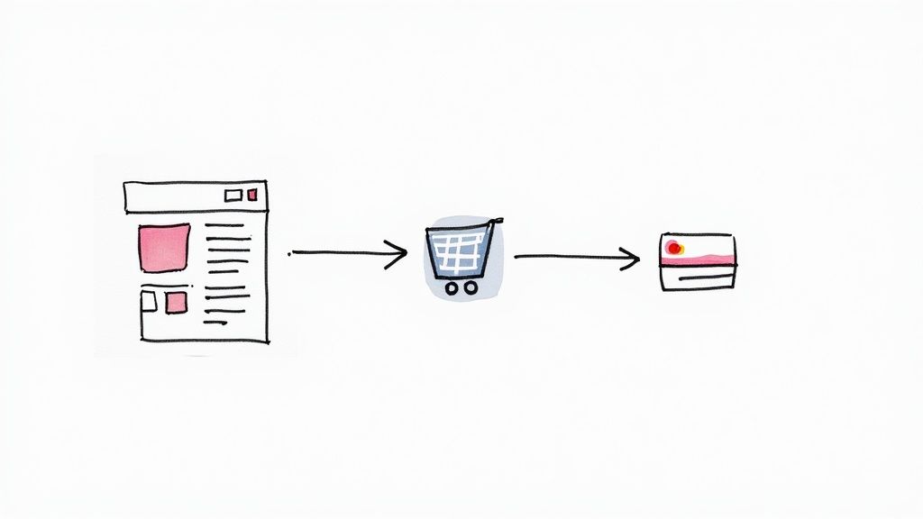
Crafting a Seamless Path from Product to Payment
This is where the magic happens—or doesn’t. A shopper can absolutely love your brand and trust your site, but if the journey from finding a product to checking out is clumsy, that sale is gone. The two make-or-break moments in this journey are the Product Detail Page (PDP) and the checkout process itself. Nailing them is everything.
browsing an ecommerce website
Think of your PDP as your digital sales floor. It’s where you have to answer every question, handle objections, and build enough confidence for someone to click “Add to Cart.” If this page fails, nothing else you do matters. The checkout, on the other hand, is the final hurdle where even the tiniest bit of friction can send a shopper running.
Transforming Product Pages into Conversion Engines
Your product page has one job: convince the visitor this product is the perfect solution for their problem. Way too many stores just list off technical specs and features. That tells a customer what the product is, but not why they should care. To actually connect with them, you have to translate features into real-world benefits.
For instance, don’t just say a backpack has “water-resistant nylon.” Instead, say it “keeps your laptop safe and dry during unexpected downpours.” One is a feature; the other is a solution that speaks directly to a customer’s needs and anxieties.
But the best product pages go way beyond text. They use a mix of media to recreate the in-store experience of actually touching and feeling a product.
- High-Quality, Zoomable Images: You need to show the product from every angle imaginable—front, back, side, and close-ups of the little details. Let people zoom right in to see the fabric’s texture or the quality of the stitching.
- Product Videos in Action: A short video showing someone actually using the product is incredibly powerful. For a fashion brand, it could be a model walking in a dress. For a kitchen gadget, it could be someone effortlessly chopping vegetables.
- 360-Degree Views: This is a fantastic interactive element that lets shoppers “spin” the product around, giving them a much better feel for its design and dimensions.
A well-crafted product page doesn’t just display an item; it tells a story. It helps the shopper visualize how this product will fit into their life and solve a specific problem, making the decision to buy feel natural and easy.
User-generated content (UGC) is another absolute game-changer. Featuring photos and videos from real customers builds instant authenticity. A photo of a real person wearing your jacket in the mountains is infinitely more compelling than a sterile studio shot.
Designing a Frictionless Checkout Experience
The second a shopper adds an item to their cart, your only goal is to get them through checkout as fast and painlessly as possible. The average cart abandonment rate is hovering around a staggering 70%, and a complicated checkout process is a top reason why. Every extra field, every surprise cost, and every forced registration is just another excuse for them to leave. This is where smart website design plays a critical role — a clean, intuitive checkout flow can quietly remove friction and keep buyers moving forward instead of second-guessing their purchase.
The checkout is a delicate moment where trust is everything. Reassure shoppers with visible security badges (like SSL certificates and accepted payment logos) and offer multiple payment options like PayPal, Apple Pay, and Google Pay. These express options let returning customers buy something in just a few seconds. Digging into these issues is fundamental, and you can explore more tactics in this guide on 7 ways to reduce shopping cart abandonment. By removing every possible obstacle, you create a smooth runway that guides excited shoppers straight to the “Complete Order” button.
Using Personalization to Guide Shoppers to a Sale
Let’s be honest, a generic, one-size-fits-all shopping experience is a guaranteed way to lose customers. Today’s shoppers expect you to get them to know what they want, sometimes even before they do. This is where personalization stops being a buzzword and starts being your most valuable guide. It’s not about selling to them; it’s about guiding them on a journey that feels like it was built just for them.

personalized online shopping experience
When done right, personalization isn’t creepy; it’s helpful. It uses data to anticipate needs and smooth out the wrinkles in the shopping experience, creating a much clearer path from discovery to purchase. By shaping what a user sees, you can dramatically lift both engagement and your bottom line.
Smart Product Recommendations That Actually Work
One of the heaviest hitters for improving e-commerce conversion rates is a smart product recommendation engine. This goes way beyond just slapping a “best-sellers” carousel on your homepage. True personalization is all about relevance and context.
Picture this: a customer has been browsing your site for running shoes and has clicked on three different pairs. A truly smart system picks up on this. It then showcases complementary products like moisture-wicking socks, running belts, or even GPS watches on the product and cart pages. This isn’t just a random upsell; it’s a genuinely useful suggestion that makes their main purchase even better.
You can put this into action in a few different ways:
- “Frequently Bought Together” Bundles: Group items that are often bought in the same order. This is a classic for a reason—it works by making the shopper’s life easier.
- “Because You Viewed…” Carousels: Show similar or related items based on a user’s recent clicks. This keeps them exploring if their first pick wasn’t quite right.
- Personalized Homepage: Once someone has browsed your site, your homepage can dynamically change on their next visit to feature the categories and products they’ve already shown interest in.
Deploying Conversational Support Strategically
Sometimes, a shopper just gets stuck. They might have a quick question about sizing, shipping, or a product feature. If they can’t find an answer right away, there’s a good chance they’ll just leave. This is where live chat and chatbots act as your on-demand sales assistants, ready to jump in at that exact moment of hesitation.
Deploy a chatbot to handle the common, repetitive questions 24/7. Simple queries like “What is your return policy?” get answered instantly, freeing up your human support team to tackle the more complex stuff.
The real goal of on-site support isn’t just to solve problems—it’s to build confidence. Getting a question answered in seconds can be the final nudge a hesitant shopper needs to feel secure enough to click “buy.”
Proactive chat prompts are also incredibly powerful. For example, if a user has been lingering on the checkout page for more than a minute, a chat window can pop up with a simple, “Hi there! Have any questions about your order?” This timely little intervention can be the difference between a sale and an abandoned cart. For a deeper dive into tailoring these kinds of experiences, check out these strategies for leveraging AI for website personalisation.
Using On-Site Messaging to Nudge and Inform
Small, contextual on-site messages can have a massive impact on a shopper’s behavior without ever feeling intrusive. Think of them as subtle nudges that deliver valuable information or a little incentive right when it matters most.
Here are a few real-world examples:
- The Free Shipping Bar: A banner at the top of your site showing how close a shopper is to getting free shipping (e.g., “You’re only $15 away from free shipping!”). It’s a simple but potent tactic for increasing the average order value.
- Exit-Intent Offers: Just as a user’s cursor moves toward the exit, a pop-up appears with a last-chance offer, like 10% off their order or a friendly reminder of the awesome items sitting in their cart.
- Low-Stock Alerts: Displaying a message like “Only 3 left in stock!” on a product page creates a natural sense of urgency that encourages people to act now instead of later.
Adopting a Data-Driven Testing Mindset
Guesswork is the most expensive mistake you can make in e-commerce. Seriously. Too many brands throw changes at their site, cross their fingers, and just hope for the best. A data-driven testing mindset flips that script entirely, turning your website into a lab for continuous improvement.
Every change becomes a calculated experiment designed to give you a clear answer, not just a gut feeling.
This is the real secret to sustainably improving e-commerce conversion rates. You stop making decisions based on what you think your customers want and start building based on what the data proves they actually want. It’s a powerful shift from opinions to evidence, one small test at a time.
Demystifying A/B Testing
At its heart, A/B testing (or split testing) is refreshingly simple. You create two versions of a webpage: your original “A” version and a “B” version with one specific change. Then, you show each version to a different slice of your audience to see which one performs better. Easy enough, right?
The catch is that a successful test needs a solid hypothesis. A weak hypothesis is vague—something like, “a new button might work better.” A strong one is specific and measurable: “Changing the ‘Add to Cart’ button color from blue to bright orange will increase clicks by 15% because orange stands out more against our white background.”
See the difference? This forces you to think critically about why you’re making a change and ties it directly to a business outcome. By testing a single, focused change, you can confidently attribute any performance difference to that one tweak.
High-Impact A/B Testing Ideas to Increase Conversion
Not sure where to start? Some tests just pack more punch than others. I’ve seen brands spend weeks testing tiny font changes with zero impact, while a simple headline tweak doubled their sign-ups.
Here are a few high-impact ideas I’ve seen deliver real results, categorized by their potential to move the needle.
|
Element to Test |
Example Variation A |
Example Variation B |
Potential Impact |
|
Call-to-Action Text |
“Buy Now” |
“Get Yours Today” |
Medium |
|
Product Image Style |
Clean studio shots |
Lifestyle images with models |
High |
|
Headline Copy |
Feature-focused (e.g., “100% Organic Cotton”) |
Benefit-focused (e.g., “The Softest Tee You’ll Ever Wear”) |
High |
|
Checkout Form Layout |
Multi-page checkout |
Single-page accordion checkout |
Very High |
|
Homepage Hero Banner |
Static image with text overlay |
Short, auto-playing video |
Medium |
This table isn’t exhaustive, of course, but it’s a great starting point. The goal is to focus your energy on the tests most likely to give you a meaningful lift, especially when you’re just getting started.
Turning Clicks into Actionable Insights
While A/B testing tells you what is happening, it doesn’t always tell you why. That’s where qualitative data comes in, giving you a behind-the-scenes look at the user experience and uncovering friction points you never knew existed. You’re no longer just looking at numbers; you’re watching real human behavior unfold.
Tools like heatmaps and session recordings are absolute goldmines for this. They turn anonymous clicks into a visual story of your customer’s journey.
- Heatmaps: These show you exactly where users click, move their mouse, and how far they scroll. You might discover that everyone is trying to click on a non-clickable image (a clear design flaw) or that nobody is scrolling far enough to see your glowing customer testimonials.
- Session Recordings: Think of these as a screen recording of a user’s entire visit. You see their mouse movements, where they get stuck, and where they rage-click in pure frustration. Watching just a handful of these is often an incredibly eye-opening experience that reveals usability issues an A/B test could never uncover on its own.
For example, a session recording might show you that ten different users struggled to find the shipping policy link before abandoning their carts. This isn’t just data; it’s a direct command from your customers telling you exactly what to fix.
When you combine the quantitative proof from A/B tests with the qualitative “why” from user behavior tools, you create a powerful feedback loop. An insight from a heatmap informs your next testing hypothesis, and the results of that test validate (or kill) your assumption. This is the engine of continuous optimization, ensuring every decision you make is grounded in solid customer evidence.
Common Questions on Conversion Rate Optimization
Even with the best tactics in hand, you’re bound to have some questions. Let’s tackle the most common ones that come up when store owners get serious about improving e-commerce conversion rates.
Think of this as your quick-reference guide for navigating those inevitable “what if” scenarios.
How Quickly Can I Expect to See Results?
Ah, the big one. And the honest answer is: it really depends.
Some changes can give you a lift almost overnight. Fixing a broken link in your checkout or making your shipping costs crystal clear are the kinds of quick wins that remove major roadblocks for shoppers. You’ll see the impact right away.
But the more strategic, needle-moving improvements? Those take time. Running an A/B test on your homepage that’s actually reliable might take a few weeks just to collect enough data. Building a solid foundation of authentic customer reviews is a long game, not an instant fix.
The secret is to work on both at the same time—grab the low-hanging fruit while you plant seeds for bigger, long-term growth. A good benchmark to keep in mind is incremental progress. A 0.25% improvement month-over-month might not sound like much, but it adds up to a massive gain over a year.
Is It Better to Focus on Desktop or Mobile Conversions?
It’s tempting to pick one, but you absolutely have to focus on both. You just have to think about them differently.
Mobile is where most of your traffic comes from—often up to 75% in many retail niches. It’s the primary channel for discovery, browsing, and initial interest. Because of that, your mobile experience needs to be lightning-fast, clean, and incredibly simple to navigate.
But here’s the kicker: desktop is often where the sale actually happens. It’s not uncommon to see a desktop conversion rate that’s nearly double what you get on mobile. Shoppers will often browse on their phone and then switch to a laptop or PC to complete the purchase because it feels more secure and less clunky.
Think of mobile as your digital storefront window—it has to be compelling enough to draw people in. Your desktop site is the checkout counter—it needs to be efficient, trustworthy, and completely frictionless. If you drop the ball on either, you’re leaving a huge hole in your customer journey.
Start by making your mobile site flawless for browsing. Then, obsess over making the desktop checkout process as simple as humanly possible.
What Is a Good Ecommerce Conversion Rate to Aim For?
There is no magic number. You’ll hear the industry average is somewhere between 2% and 3%, but that figure is almost useless because it varies so much depending on what you sell, your price point, and where your traffic is coming from.
Here’s a much better way to think about it:
- High-Ticket Items: Selling furniture or high-end electronics over $500? A 1% conversion rate could be fantastic. The buying cycle is longer and requires more consideration.
- Low-Cost Consumables: If you’re selling coffee or skincare, you should be aiming for 3% or higher. These are often repeat buys or impulse purchases.
- Industry Matters: The food and beverage industry often sees conversion rates around 4.9%, while home goods might hover closer to 1.4%. Context is everything.
Instead of chasing some universal benchmark, your first job is to figure out your baseline. Once you know that, your only goal should be continuous improvement. Bumping your rate from 1.5% to 2% is actually a 33% increase in sales. And that’s a huge win, no matter what anyone else’s numbers are.
What if I Don’t Have Enough Traffic for A/B Testing?
This is a totally valid concern for smaller or newer stores. To get trustworthy results from an A/B test, you really need thousands of visitors and hundreds of conversions for each version you’re testing. If you don’t have that kind of volume, a split test can give you bad data that sends you in the wrong direction.
But that doesn’t mean you’re stuck. You just need to shift your focus from quantitative to qualitative data.
Instead of A/B testing, lean on these methods:
- Session Recordings: Use a tool like Hotjar or Microsoft Clarity to watch how real people actually use your site. You’ll quickly see where they get stuck, confused, or frustrated.
- User Surveys: A simple on-page poll asking, “What’s the one thing stopping you from buying today?” can give you incredibly direct and actionable feedback.
- Heatmaps: See exactly where people are clicking—and more importantly, where they aren’t. Are they trying to click on something that isn’t a link? That’s a clear signal to make a change.
These approaches give you powerful, direct insights from your users. You can confidently make changes based on these real-world conversion rate optimization tips shared in the article.
Conclusion: E-commerce Conversion Rate Optimization
Improving e-commerce conversion rates is essential for any online business aiming to maximize sales and profitability. Businesses need to use effective conversion rate optimization strategies to increase conversion rates and transform visitors into paying customers. Utilizing tools like Google Analytics allows you to calculate your conversion rate and understand the percentage of website visitors who make a purchase. You see, optimizing your e-commerce site for mobile devices is crucial, as a significant number of users shop via mobile, and a higher conversion rate means more sales.
One of the best ways to enhance these rates is by reducing bounce rates and improving the shopping experience. Implementing best practices, such as providing detailed product information and high-quality images, can help build trust with potential buyers. Furthermore, incorporating chatbots into your e-commerce strategy not only offers immediate assistance to customers but also enhances engagement, thereby boosting conversions. Chatbots can guide users through their shopping journey, answer queries, and even encourage signing up for a newsletter, all of which contribute to improved conversion rates.
In summary, focusing on ways to boost conversion rates through targeted optimization efforts and advanced tools will lead to higher conversion rates. Whether you are looking to increase e-commerce conversion rates or simply want to understand what conversion rate means for your business, adopting these strategies will undoubtedly help you achieve your goals.

Related Posts
5 Best Chatfuel Alternatives in 2026 You Need to Try!
April 6, 2026How to Customize Your Facebook Page URL: A 2026 Guide to Boost Your Brand
April 5, 2026Chatbots for Banks: The Ultimate Guide for 2026
April 4, 2026
Founder Clepher