User experience optimization (UXO) is about engineering digital journeys — from your website to your Messenger bots — that don’t just function, but perform. It’s the shift from surface-level design to intentional systems built around real user needs. Instead of focusing only on aesthetics, UXO helps you prioritize clarity, speed, and intuitive flow across every interface.
At its core, UXO exists to eliminate friction. When usability is seamless and the interface feels natural, users don’t hesitate — they act. That action translates directly into higher engagement, stronger conversions, and measurable growth. The brands that win are the ones that continuously improve the user experience, turning efficiency into satisfaction and satisfaction into loyalty.
When you design for user satisfaction first, business performance follows.
Why User Experience Optimization Is Your Biggest Growth Lever
Let’s skip the theory and get straight to the point. Imagine an e-commerce store bleeding sales because its checkout process is a confusing, multi-step nightmare. Now, picture another store using a simple chat flow on Instagram to instantly answer product questions, guide shoppers to the right size, and even recover abandoned carts automatically.
That’s user experience optimization in action. It isn’t a fluffy design concept; it’s a direct line to your revenue.
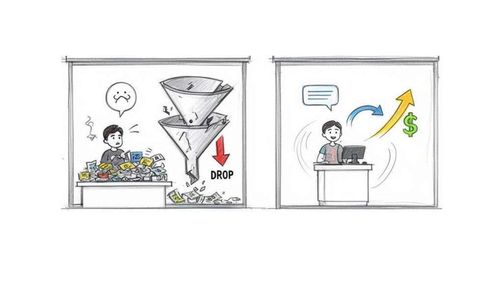
conversion funnel
For e-commerce and DTC brands, the business case for obsessing over UX is overwhelming. The numbers don’t just talk—they shout.
Every $1 invested in UX can return $100 in revenue. That’s a staggering 9,900% ROI. This is the reality for businesses that see customer loyalty and retention skyrocket after they commit to improving the user’s journey.
To get ahead, you need a clear framework. Below is a breakdown of the core pillars of modern user experience optimization, what they mean in practice, and how they directly transform your business.
Key Pillars of Modern User Experience Optimization
| Pillar | What It Means | Business Impact |
|---|---|---|
| Research & Analytics | Digging into user data (heatmaps, surveys, analytics) to find where people get stuck. | Reduces guesswork, focuses resources on high-impact problems, and uncovers hidden opportunities. |
| Funnel & Microcopy | Simplifying the path to purchase and refining every button, headline, and instruction. | Increases conversion rates, lowers cart abandonment, and builds user confidence at each step. |
| Performance & Accessibility | Ensuring your site is fast, works on all devices, and is usable by people with disabilities. | Boosts SEO rankings, decreases bounce rates, and expands your potential customer base. |
| Conversational UX | Using chatbots and AI agents to provide instant, helpful interactions on messaging apps. | Drives leads 24/7, improves customer satisfaction, and automates sales and support processes. |
| A/B Testing & Iteration | Continuously testing changes to find what really works, backed by hard data. | Leads to incremental gains that compound over time, creating a superior, data-driven experience. |
These pillars aren’t isolated tasks; they work together to create a cohesive growth engine. By focusing on these areas, you move from just having a digital presence to owning a digital experience that wins customers.
From Website Clicks to Chat Conversations
A great user experience touches every single interaction a customer has with your brand. It’s what separates a happy, returning customer from a bounce statistic.
This includes actionable areas like:
- Website Navigation and Page Speed: Can users find what they need instantly? A slow-loading site is a conversion killer—you start losing 24% of users for every extra second it takes to load.
- Conversion Funnel Clarity: Is your call-to-action buried at the bottom of the page? Or is the path from your landing page to the “Buy Now” button a frustrating maze?
- Conversational Support: What happens when someone DMs your brand on Instagram? Do they hit a brick wall, or does a helpful, automated conversation solve their problem on the spot? This is a key piece of your overall customer experience management strategy.
By 2026, the experience you provide is what will truly win and keep customers. A slow website or a clunky chatbot is the digital equivalent of a locked front door.
This guide will walk you through the practical, actionable steps to transform your digital presence. We’ll show you how advanced user experience optimization is no longer just for massive corporations. It’s now accessible to everyone, especially with platforms like Clepher that turn complex chat automation into a simple, drag-and-drop reality.
Mastering Conversational UX with AI Chatbots
Conversational experiences represent one of the most powerful frontiers in modern UX design. The era of rigid, decision-tree bots is over. Today’s AI-powered assistants are proactive systems built to enhance the user experience in real time — guiding decisions, resolving pain points instantly, and driving revenue 24/7.
True conversational UX follows proven best practices: anticipate intent, reduce cognitive load, and design flows that feel natural rather than forced. Instead of overwhelming users with static pages and cluttered UI, a smart assistant simplifies choices and moves the conversation forward with clarity. That’s optimizing UX at a structural level — not just polishing visuals, but engineering interaction.
Imagine a potential customer clicks your Facebook ad for a new skincare line. Instead of landing on a generic product page, they’re welcomed into a Messenger conversation tailored to their goals. The assistant asks a few smart questions, recommends products based on their concerns, and removes hesitation before it forms. This is how you improve user engagement — by transforming passive browsing into active, guided dialogue that converts.
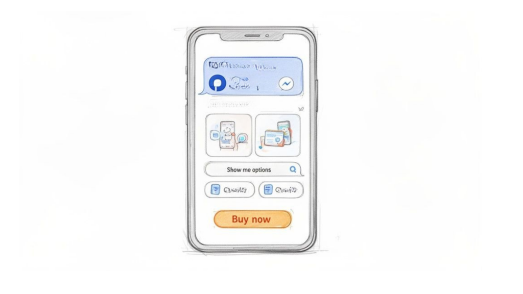
user experience optimization mobile app
Turning Conversations into Conversions
A well-designed chatbot doesn’t just answer questions; it creates a seamless sales funnel right inside the chat window. An e-commerce brand can use a Clepher Flow to guide a user from an ad click all the way to a completed purchase, without them ever leaving Messenger.
Here’s a practical example of how that conversation could unfold:
- Product Discovery: The bot kicks things off by asking a few simple questions. “Welcome! To find your perfect match, tell me a bit about your skin. Is it mostly oily, dry, or a combination?”
- Personalized Recommendation: Based on the user’s answer, it suggests the ideal product. “Great! Based on that, our new Vitamin C Brightening Serum would be perfect for you. It helps with exactly those concerns.”
- Instant Checkout: The bot then presents a “Buy Now” button that leads directly to a secure checkout within the chat. This completely bypasses the friction of navigating a complex website.
This journey feels less like a sales pitch and more like getting expert advice from a helpful assistant. It’s a powerful form of user experience optimization because it removes friction at every single step.
The goal is to make the path to purchase so effortless that it feels like the natural conclusion to a helpful conversation. This approach builds trust and loyalty far more effectively than a traditional, impersonal website experience ever could.
Optimizing Your Chatbot Scripts
Just like a landing page, your conversational scripts need constant refinement. This is where A/B testing is non-negotiable. With a tool like Clepher, you can test different versions of your chat flows to see what actually resonates with your audience.
For example, you could use a random path distribution feature to test two different opening messages. Does a friendly, emoji-filled greeting get more engagement, or does a more direct, problem-solving approach perform better? Tracking the completion rates for each path lets you make data-backed decisions to improve your conversational UX. If you’re new to this, you might be interested in our guide on how to design a chatbot that truly connects with users.
Even the words you choose for buttons and quick replies—known as microcopy—have a massive impact. Small tweaks here can lead to surprisingly big results.
- Instead of a generic “Learn More,” try “See the results.”
- Instead of “Submit,” use “Get my free guide.”
- Instead of just “OK,” try a more human reply like “Got it!” or “Sounds good!“
These subtle changes make the interaction feel more natural and action-oriented, encouraging users to keep the dialogue going and move closer to your conversion goal.
Auditing Your Website and Conversion Funnels
A slick conversational strategy is great, but it’s only half the battle. To truly nail user experience optimization, you have to fix the traditional website journey, too. Let’s walk through a tactical audit of your conversion funnels, treating it like a hunt for every point of friction.
We’ll start at the top—the landing page—and follow a user all the way to that final “thank you.”
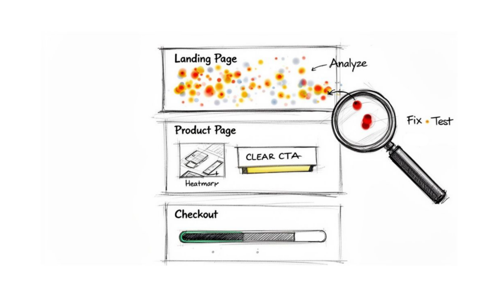
user experience optimization conversion funnel
Pinpointing Where Users Lose Interest
First, become a serious student of user behavior. Effective user research starts with observation, not assumptions. Tools like heatmaps and session recordings expose the role of user intent in real time — where attention flows, where hesitation begins, and where expectations break. They reveal exactly what users do, not what you think they do.
A heatmap might show visitors repeatedly clicking on an unlinked image — a dead end silently draining conversions. Session recordings go further, showing the precise moment confusion sets in and user expectations collapse. That friction is where your UX optimization efforts should begin.
These insights transform abstract metrics into actionable direction. If 70% of mobile visitors abandon a product page before reaching customer reviews, the issue isn’t traffic — it’s structure. Your strongest social proof is buried, and the experience isn’t aligned with user priorities.
Optimization tips are meaningless without behavioral context. Don’t just review dashboards; watch real journeys unfold. One frustrated session recording can teach you more about optimizing UX than a dozen spreadsheets ever could.
Enhancing Your Product Pages and Checkout
Once you’ve found the leaky spots in your funnel, it’s time to patch them up. Every stage is a new opportunity to remove friction and build momentum toward a sale.
If you really want to go deep on this, the strategies for website conversion rate optimization offer a fantastic framework.
Here are a few high-impact areas to focus on first:
- Product Pages: Your calls-to-action (CTAs) should be impossible to miss. Use high-quality photos and videos that answer questions visually. Put social proof like star ratings and testimonials “above the fold” where people can actually see them.
- Checkout Process: This is where so many sales go to die. Streamline it relentlessly. Offer a guest checkout option, show a clear progress bar, and only ask for information that is absolutely essential. Every extra form field is another reason to abandon a cart.
The Non-Negotiable Need for Speed
Underpinning this entire audit is one simple truth: a slow website is a broken website. Today, speed isn’t a feature; it’s a basic requirement.
A key metric to obsess over is Largest Contentful Paint (LCP), which measures how long it takes for the main content of a page to load. Aim for an LCP of under 2.5 seconds.
Why is this so critical? Google’s research shows that sites meeting these Core Web Vitals thresholds see 24% less user abandonment. Speed isn’t just a technical detail—it’s a fundamental part of a good user experience. A fast site tells users you respect their time, keeping them engaged and moving smoothly toward conversion.
Using Data and Analytics for Continuous Improvement
Great user experience isn’t built on guesswork; it’s forged from data. To truly improve how people interact with your brand, you have to move beyond vanity metrics like page views. It’s time to focus on the numbers that tell a story about user behavior and satisfaction.
Raw data is just noise. Actionable insights are what drive real change. This means tracking the crucial UX metrics that directly reflect the quality of your users’ journey.
Focusing on Actionable UX Metrics
Instead of getting lost in a sea of analytics, concentrate on a few key performance indicators (KPIs) that give you a clear signal on whether your experience is working. These metrics expose friction points and highlight opportunities you might otherwise miss.
Here are the metrics that really matter:
- Task Success Rate: This is the ultimate test. Can users actually do what they came to do? Whether it’s completing a purchase or signing up for a newsletter, a low success rate is a massive red flag.
- User Error Rate: How often do people make mistakes while navigating your site or bot? A high error rate often points to confusing instructions, poorly designed forms, or unclear pathways. It’s a direct sign of user frustration.
- Customer Satisfaction (CSAT): Sometimes, you just need to ask. A simple “How satisfied were you with this experience?” survey at the end of a key interaction provides direct, invaluable feedback on how users feel.
To get the most from your data, it’s a good idea to understand and track the essential metrics for QA teams, as they often have a direct impact on the user experience. These metrics give you a structured way to measure quality from a technical standpoint.
A Real-World Scenario with Clepher Analytics
Let’s make this practical. Imagine you’re an online course creator using a Clepher chatbot to onboard new students through Messenger. Your sign-up numbers look great, but you’ve noticed many students never complete the initial setup process inside the chat.
The Clepher analytics dashboard is where you’ll dig for answers.
This dashboard visually maps out the drop-off points in your conversational flow. You can see exactly which message or question is causing the most people to abandon the chat.
Looking at the data, you discover that 60% of new students are dropping off when the bot asks for their email address without explaining why. With this insight, you form a hypothesis: “If I add a sentence explaining why I need their email—to send course materials—the completion rate will increase.”
You then tweak the microcopy in your Clepher Flow and watch the analytics. The result? Drop-offs at that specific step decrease by half, and your overall onboarding completion rate jumps significantly. This is the power of a data-driven mindset in action. If you’re looking to dive deeper into this process, our guide on how to track website visitors is a great resource.
Data tells you where the problem is, but user behavior tells you why. A drop-off rate is a symptom; a confusing question in your chatbot is the cause.
The Power of Segmentation and Personalization
To take it a step further, use this data to segment your audience and deliver a more personalized experience. In Clepher, this is easy to do using tags. You can tag users based on their actions, what they’ve bought, or how engaged they are.
This allows you to create different experiences for different user groups.
- New Visitors: Greet them with a welcome message that points them toward your most popular products or blog posts.
- Repeat Customers: Show them a targeted Messenger offer related to their past purchases or a special “thank you” discount.
This level of personalization shows your audience you understand their needs, which builds a stronger connection and naturally drives better results. Continuous improvement is a cycle: gather data, find the friction, test a solution, and repeat.
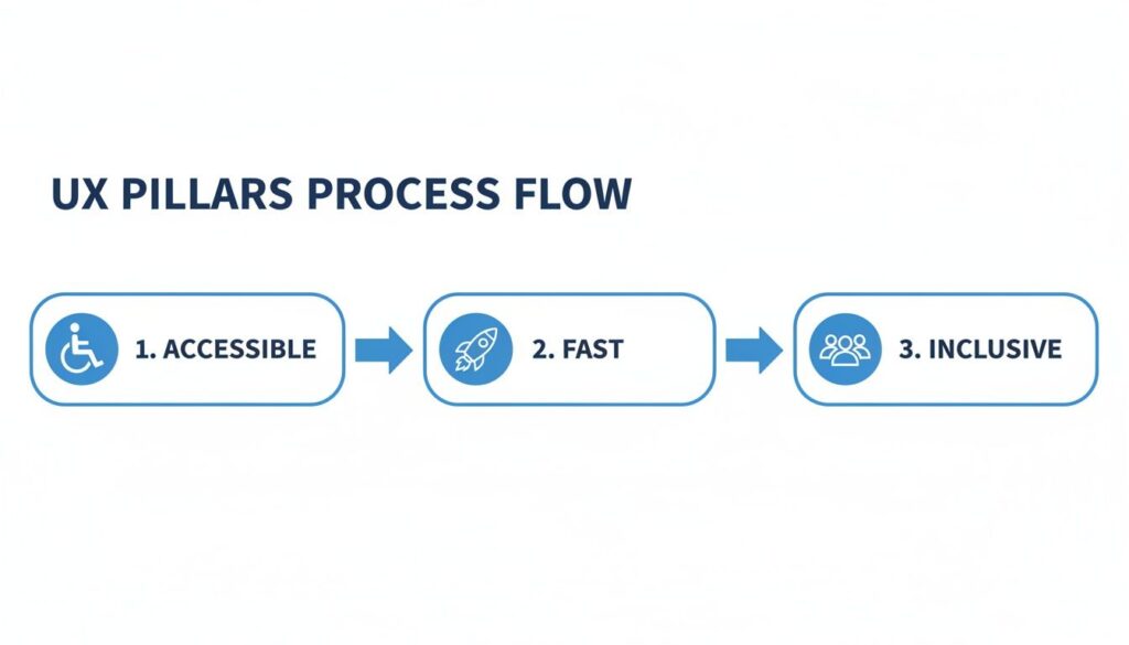
Designing for Accessibility and Peak Performance
A fantastic user experience must be inclusive for everyone, and it has to be fast. Dead simple.
Think of your website like a physical store. If the doors are too heavy, the aisles are cluttered, and the checkout line is a mile long, people will leave—no matter how great your products are. The same goes for your digital presence. That’s why performance and accessibility aren’t just add-ons; they’re the foundation of user experience optimization.
Accessibility isn’t a legal checkbox or a niche concern. It’s a smart business move. When you design for inclusivity, you open your doors to the one in four adults in the U.S. living with a disability. That’s a massive market of potential customers who are often overlooked. Get it right, and you’ll boost your brand reputation and create a better experience for all your users.
An accessible website isn’t a niche feature—it’s just a better-designed website. Many improvements made for accessibility, like clear structure and readable text, benefit all of your users, not just those with disabilities.
Making Your Experience Inclusive
You don’t need a complete site overhaul to get started. Small, intentional changes can make a world of difference.
Here are a few practical places to begin:
- Check Your Color Contrast: If your text blends into the background, it’s invisible to users with low vision. Use a contrast checker to ensure your text has a ratio of at least 4.5:1 against its background.
- Write Descriptive Alt Text for Images: Screen readers use alt text to describe images to visually impaired users. Instead of “image1.jpg,” write something helpful: “A smiling customer holding a blue skincare bottle.”
- Test for Keyboard-Only Navigation: Can someone navigate your entire site using just the Tab, Enter, and arrow keys? This is a critical test. Many people with motor disabilities depend on it, and it’s a great way to check if your site is logically structured.
These fixes aren’t complicated, but they make your site usable for more people. That directly translates to wider reach and more potential revenue.
The Critical Need for Speed
While accessibility opens your doors to more people, performance is what keeps them from walking right back out. We’ve mentioned Core Web Vitals before, but it’s so important it’s worth repeating: speed is non-negotiable. A site that meets Google’s Core Web Vitals thresholds can see 24% less user abandonment.
Think of a user’s patience like a phone battery draining fast. Every extra second of loading time is another chunk of that battery gone. To keep people engaged, you have to be ruthless about optimizing for speed.
This means tackling straightforward technical fixes with a huge payoff. Start by compressing your images—you can drastically reduce their file size without a noticeable drop in quality. Enable browser caching so repeat visitors don’t have to re-download your entire site. Finally, minify your site’s code (HTML, CSS, and JavaScript) to cut every possible millisecond of load time.
A fast, accessible digital presence is the bedrock of effective user experience optimization. It ensures that everyone can use what you’ve built and that no one gives up in frustration before they even see what you have to offer.
Your User Experience Optimization Action Plan
Theory is great, but results come from action. Let’s break everything down into a practical, get-it-done plan. Don’t feel overwhelmed. Think of user experience optimization as a series of small, consistent improvements that stack up to create massive long-term growth.
This framework is your project plan. You can start implementing it today.
Week 1: Audit and Research
Your first week is all about discovery. Before you fix anything, you need a clear picture of what your users are experiencing right now. The goal is to ditch assumptions, gather baseline data, and pinpoint the most painful friction points.
Here’s your to-do list:
- Install Heatmap and Session Recording Tools: You need to see what your users are doing. Find out where they click, how far they scroll, and watch actual session recordings to understand their real behavior.
- Dig Into Your Analytics: This is non-negotiable. Identify your top exit pages and, more importantly, figure out where people are dropping off in your conversion funnels.
- Design Your First Welcome Chatbot Flow: Jump into a tool like Clepher and build a simple, automated welcome message for your Messenger or Instagram audience. This is your first step into conversational UX, and it’s easier than you think.
This initial audit turns vague guesses like “I think the landing page is confusing” into concrete problems you can actually solve.
user experience pillars
As you can see, a great experience isn’t just about looking good. It has to be accessible, fast, and inclusive to truly succeed.
Weeks 2-3: Implement and Test
Alright, time to roll up your sleeves and act on your research. The strategy is simple: focus on the highest-impact, lowest-effort fixes first. This helps you build momentum and get some quick wins.
The goal isn’t perfection; it’s progress. A small improvement that goes live is infinitely better than a massive redesign that never gets finished.
This is also when you’ll want to start A/B testing your changes. For instance, you could test a new, punchier headline on your landing page against the old one. Or maybe you’ll try a different opening question in your Clepher chatbot to see if it hooks more people into the conversation.
Week 4 and Beyond: Measure and Iterate
User experience optimization is not a one-and-done project. It’s a continuous journey. From here on out, you’re entering a cycle of measuring results, learning, and iterating.
Dive into your chatbot analytics in Clepher to spot drop-off points. Analyze your A/B test results to see what actually moved the needle. Keep gathering user feedback.
By constantly refining the experience based on real, hard data, you’ll naturally boost your bottom line. Focus on the user, and the growth will follow.
Burning Questions About User Experience
Start your journey with Clepher now!
Related Posts
Facebook Messenger on Web: A 2026 Business Guide
April 12, 2026What Is an Open Domain Chatbot?
April 11, 2026Conversational AI for Sales: Your 2026 Guide to Boosting Revenue
April 10, 2026
Founder Clepher