
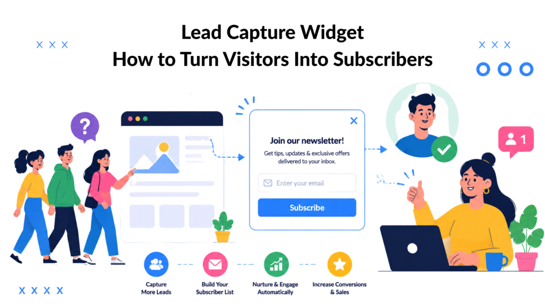
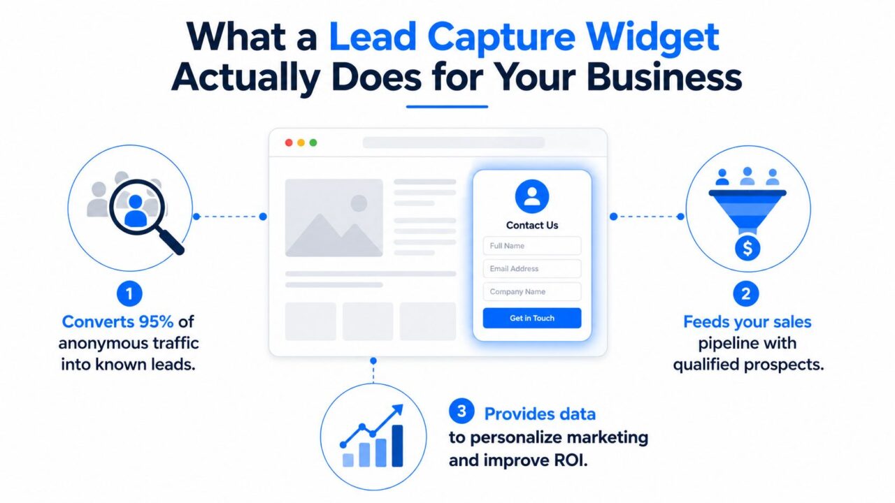
The biggest mistake in lead capture is thinking every visitor is ready to talk. In reality, an average eCommerce store captures emails from fewer than 5% of visitors, which leaves about 95% of traffic anonymous unless you put a capture mechanism in place; top widget campaigns can perform several times the average on the same traffic base, according to benchmarking cited by OpenSend. That’s why the lead capture widget matters; it turns silent visits into known contacts you can route into email, SMS, retargeting, and sales follow-up.
What a Lead Capture Widget Actually Does for Your Business
A lead capture widget is the on-site interface that turns browsing into a handoff. In practice, it can be a popup, slide-in, inline form, floating bar, or chat-based capture flow that collects contact information and pushes it into your CRM or automation stack, often through embedded JavaScript. Market Leader describes that kind of handoff clearly: name, email, phone, and message fields can be imported directly into its CRM, while LeadSquared’s setup flow shows the usual pattern of adding a JavaScript snippet to the website and publishing the widget live.
The economic logic is simple. If most visitors leave without identifying themselves, even a modest improvement in capture rate compounds into a much larger addressable audience over time. That matters because the underlying format wasn’t invented from scratch; it evolved from the same web forms marketers had already trusted. HubSpot reported that 74% of marketers used web forms for lead generation in 2019, and 49.7% said web forms were their highest-converting lead-gen tool, while only 17% were using chatbots and 6.5% said chatbots were their highest-converting capture tool, which shows how strongly the market already favored embedded on-site capture (HubSpot).
Why the format still works
Innovation wasn’t just about replacing lead capture; it was about improving how people interact with it. HubSpot also found the average web form had about 5 fields, and multi-step forms converted 86% higher than single-step forms in that same study, which established a design principle that still holds up today: reduce friction, break the ask into smaller steps, and use progressive disclosure (HubSpot).
Practical rule: If your widget feels like a paperwork gate, it will underperform. If it feels like a guided exchange, it can qualify and route leads without killing momentum.
That’s the main business value. A good widget doesn’t just collect names; it gives you a structured way to identify intent, move leads into follow-up faster, and personalize what happens next. If you’re building a subscriber base from scratch, the mechanics behind that system are worth studying in more depth, and a useful starting point is this guide to building an email list.
Lead Capture Widget Marketing Diagram
Common Lead Capture Widget Types and When to Use Each
A capture widget should fit the lead’s intent and the amount of qualification you need. Push too hard, and you lose volume. Ask too little and sales spends time on low-fit leads. The right format depends on where the visitor is in the journey, how warm the traffic is, and whether the page needs interruption or just a light nudge.
Match format to intent
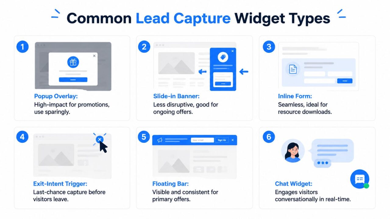
Use a popup overlay when the offer is immediate and simple to understand, such as a first-order discount in eCommerce or a limited-time promotion. It is the most disruptive format, so it makes sense when the incentive is clear and the audience already has some level of interest.
A slide-in banner works better for blog content upgrades, newsletter signups, or recurring offers that do not need to take over the page. It stays present without blocking the content, which makes it a stronger fit for educational pages and long-form articles where readers are still consuming information.
An inline form belongs on a landing page or resource page where the visitor already expects to trade information for something valuable. It feels native because it is part of the page. That makes it a strong choice for gated downloads, demo requests, and lead magnets where the surrounding context carries much of the persuasion.
Exit-intent triggers are the last-chance layer. They make sense when a visitor has shown interest but is about to leave, especially on product pages or cart flows where abandonment is common. A floating bar is the simplest persistent option, useful when you want one primary offer to stay visible across the site without forcing a modal on every visit.
Use chat when qualification matters
A chat widget works differently because it can qualify before it captures. That matters for SaaS demos, agency leads, coaching inquiries, and service businesses where budget, timeline, or project type determines whether sales should follow up. The advantage is that the exchange can feel helpful instead of transactional, which often improves lead quality even if raw capture volume drops.
The format should match the visitor’s mindset, not your internal preference. If someone wants a fast answer, start with a short conversational prompt. If they are reading a landing page, keep the capture visual and direct.
Channel-specific capture matters too. The same logic extends beyond websites into Facebook Messenger, Instagram DMs, and WhatsApp when a platform supports those channels, so the widget becomes part of a broader conversation system instead of a single-page form. For teams that want that kind of conversational flow on-site, a web chat widget can be the most practical entry point.
Lead Capture Widget Types
If you are using a conversational format, the cleanest way to think about implementation is the web chat widget: a visible entry point, a short exchange, then a direct handoff into the next step.
Design and Copy Best Practices That Drive Conversions
The highest-performing widgets don’t look busier; they feel easier. That starts with structure. HubSpot’s benchmark that multi-step forms converted 86% higher than single-step forms is the clearest signal in the provided data that the user experience matters as much as the offer itself (HubSpot). Tapform pushes the same principle into qualification flows, short questions, structured fields, and CRM handoff, so the widget gathers useful detail without making the first screen feel heavy (Tapform).
Make the first screen do less work
The first view should answer three questions fast: what is this, why should I care, and what happens when I click. That means the headline should be benefit-led, the CTA should be specific, and the form should avoid asking for anything that isn’t essential right now. HubSpot’s form guidance also notes that early-awareness offers may only need name and email, while higher-intent or high-ticket offers can justify more qualifying fields, so the copy has to match the moment, not some universal best practice (HubSpot).
Tapform’s guidance also points to visual contrast, and notes that around 90% of users choose a dark theme, which is a reminder that visible contrast affects how quickly people notice and engage with the widget (Tapform). If your CTA blends into the page, you’re asking the visitor to hunt for the next step.
Audit the widget before you test
Use this as a quick checklist:
- Field count: remove anything that doesn’t help with qualification or routing.
- CTA copy: replace generic labels with a concrete action or benefit.
- Visual hierarchy: make the button and key value message the strongest elements on the panel.
- Mobile behavior: keep tap targets large enough to avoid accidental exits.
- Theme and contrast: make sure the widget is legible on both light and dark site designs.
- Trigger timing: open only when the page context supports it, not on every page load.
If you need the widget to do all the selling, the offer is too vague. If the page sells the offer first, the widget can stay short and effective.
The best trigger is usually the one that respects page context. A blog page can wait for a scroll-based prompt. A product page may justify exit intent. A high-value landing page often works better when the form is already part of the page experience.
When Adding More Form Fields Increases Revenue
Short forms are not automatically better. They work when the visitor is early in the journey, and the only job is to start a relationship. For higher-intent offers, especially in SaaS, services, or expensive products, extra fields can improve downstream efficiency because the widget stops being a raw lead collector and starts acting as a filter.
Qualification changes the math
A widget that collects just an email gives you volume, but not much context. If the sales team then spends time chasing unqualified prospects, the form may look efficient while creating manual work. HubSpot’s note on early-awareness versus high-ticket offers gives the useful nuance here: some offers need only minimal data, while others justify more friction because the goal is to separate serious buyers from casual browsers (HubSpot).
The practical question is not how short the form can get. It is what amount of friction produces leads your team can work with. That depends on funnel stage, offer value, and response capacity. If your team cannot follow up fast, more qualification may help. If you are selling a low-consideration offer to cold traffic, keep the ask lighter.
A longer form can also protect the rest of the funnel. When a visitor has to state budget, company size, timeline, or use case, they are signaling seriousness before sales ever gets involved. That means fewer wasted calls, cleaner routing, and less time spent on prospects who were never going to buy. The trade-off is obvious, since every added field will suppress some fills, but in the right offer that drop is worth paying for.
Use progressive profiling with intent
A good compromise is progressive profiling. Ask for basic contact details first, then collect budget, timeline, pain points, or service type through a second step or a conditional branch. Tapform’s guidance on short questions and structured fields fits that model well, because the data gets passed into CRM workflows where sales can prioritize warmer leads (Tapform).
More fields are not the point. Better routing is the point.
That distinction matters in agencies and SaaS sales teams. An agency might want project scope and timeline before a call. A SaaS company might want company size and use case before routing a demo request. A coach might ask one qualification question before booking. In each case, the extra step improves lead quality, even if it lowers raw form-fill volume.
Implementing Lead Capture Widgets with Clepher
Clepher’s Web Chat Widget is built around conversational capture, so the flow can ask questions before it asks for contact details. That works well for eCommerce brands that want to surface product intent, agencies that want to sort inbound leads by service type, and SaaS teams that want to route visitors into onboarding or support. The point isn’t to replace forms entirely; it’s to turn the first interaction into a guided exchange.
Build the flow around the first useful question
A practical setup starts with a greeting, then one branch that reflects the visitor’s goal. For example, a store can ask whether the visitor wants a recommendation or help with a promotion. An agency can ask what service they need. A coach can ask what result they’re trying to achieve. Once that intent is clear, the widget can request email or phone and pass the answer into the follow-up path.
Clepher supports no-code drag-and-drop flow building, so teams can shape these conversations without wiring everything from scratch. Its practical value comes from the same things growth teams usually need after capture: segmentation, custom fields, conditions, personalization tags, and integrations that move the data into email, CRM, or SMS tools.
Tie capture to the channel, not just the page
The cleanest implementations don’t stop at a website widget. They extend into Facebook Pages and Instagram accounts, which is useful for brands that get a lot of inbound conversation from social and want a consistent handoff. That matters for promotions too, because a discount-led flow can collect a subscription or a message-thread opt-in without feeling like a hard landing-page conversion.
The integration side matters just as much. Clepher connects natively with 50+ apps and also through Zapier, Make, n8n, and Pabbly, which means captured leads can go into the rest of the stack without manual copying. That’s the operational win: the widget becomes the front door, while the automation layer handles routing, tagging, and follow-up.
For teams that want a structured capture flow instead of a static form, Clepher is one option that fits that pattern without forcing a separate rebuild of the rest of the stack.
Measuring Widget Performance Beyond Conversion Rate
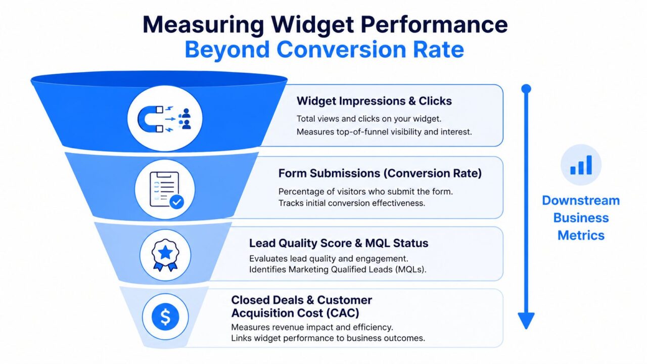
Conversion rate is useful, but it’s not enough. A widget can generate lots of submissions and still create weak leads, slow follow-up, or messy routing. The better measurement model follows the lead after the form, through qualification, sales handling, and revenue.
Track the downstream signals
The most useful metrics after submission are lead quality score, speed-to-lead, segmentation usefulness, and assisted revenue. Those tell you whether the widget is helping sales work better, not just filling a database. A high-performing variant might produce fewer raw leads but more leads that match your ideal customer profile, which is often the better business outcome.
That’s also where CRO thinking gets more practical. If you want a broader framework for page-level testing and behavioral optimization, Digital Skyrocket’s conversion rate optimization guide is a useful reference point for the testing mindset itself. The important part here is to connect test results to sales handling, not stop at the completion screen.
Build tests that follow the lead
A widget A/B test should compare more than the submit button. Track what happens after the form:
- Email engagement: do leads from one variant open and click more often?
- Sales qualification: do they get accepted by the sales team more often?
- Routing value: does one flow send better leads to the right rep or segment?
- Revenue impact: do some variants contribute more to closed deals or lower acquisition cost?
A widget that creates a smaller but cleaner pipeline can outwork a flashier form that bloats the CRM.
Clepher’s built-in analytics and A/B testing features help with this kind of comparison because you can test conversational paths instead of only testing page elements. For more complete visitor tracking and attribution, it also helps to use website visitor tracking practices so you can connect widget activity to later sessions and channels. That makes the reporting more honest, especially when the buyer doesn’t convert on the first visit.
Lead Capture Widget Performance Funnel
Privacy Compliance and Data Collection Essentials
Any widget that collects personal data needs a compliance pass before it goes live. Consent language, privacy policy access, cookie coordination, and data retention practices all matter, especially when the capture flow collects more than an email address. If you’re asking for phone numbers, budget ranges, or message details, the user should understand what happens next.
Keep collection narrow and explicit
Data minimization is the safest default. Ask only for what you need to route, respond, or qualify the lead, and don’t store fields that won’t get used. If you add a consent checkbox, make sure the language is plain, the privacy policy is easy to open, and the submission flow doesn’t hide the fact that a contact record is being created.
Double opt-in can be a smart choice when the list quality matters more than immediate volume. It slows down the handoff slightly, but it helps confirm intent and keeps your list cleaner over time. That trade-off is especially useful when the widget is feeding newsletter capture or broader nurture campaigns.
Document what you’re doing
Treat the widget as part of your data processing system, not a one-off page element. Know where submissions go, how long they’re retained, who can access them, and how a user can request removal or correction. If your platform offers GDPR tools or tag-based segmentation, use them to keep personalization aligned with consent and purpose.
The simplest launch checklist is straightforward:
- Consent checkbox: include clear opt-in language when required.
- Privacy policy link: place it near the submit action.
- Retention rules: delete data you don’t use.
- Workflow access: limit who can see submissions.
- Channel sync: make sure the follow-up path matches the consent you collected.
A compliant widget is easier to scale because legal and marketing don’t have to untangle the same mistake later. If the data structure is clean on day one, routing, personalization, and audit readiness all get easier.
If you want a capture flow that can qualify visitors instead of just collecting names, Clepher gives you a no-code way to build those conversational paths and connect them to the rest of your stack. Visit Clepher to see how its Web Chat Widget, segmentation, and integrations can fit into your lead capture workflow.
Related Posts
10 Broadcast Automation Software Platforms Compared
October 11, 2026Customer Journey Automation: The Practical Guide
October 10, 2026Lead Qualification Marketing: A Practical 2026 Guide
October 9, 2026
Founder Clepher