

UX writing is the practice of crafting the microcopy inside a product, the small bits of text like button labels, error messages, and onboarding prompts that help users complete tasks. It matters because a better user experience can deliver a 9,900% ROI, increasing conversions by 83% and even helping websites triple conversion rates when the experience is improved.
Interface text is still often treated like a finishing touch. In practice, it’s often the difference between momentum and hesitation.
A paid ad can win the click. A strong offer can create intent. But if the form label is vague, the checkout message sounds risky, or the chatbot asks clunky questions, users stall. That stall is where UX writing earns its keep.
When exploring What Is UX Writing, individuals typically encounter a neat definition and a few examples of button copy. That’s useful, but incomplete. UX writing is also a conversion discipline. It shapes how people move through signup flows, checkout paths, support journeys, and AI chatbot conversations without feeling lost, pressured, or confused.
For DTC brands and SaaS teams, that makes it much more than a writing specialty. It’s operational. It’s measurable. And in chatbot-led funnels, it’s one of the few levers that affects both user trust and sales at the same time.
Why Words Are Your Most Powerful Conversion Tool
The strongest argument for UX writing is financial. Adobe’s widely cited UX benchmark says every $1 invested in user experience yields $100 in return, which amounts to a 9,900% ROI. The same source notes that improving UX can drive an 83% increase in conversions and that strong UX can triple website conversion rates (Adobe on UX ROI and conversion impact).
Those numbers change the framing. Button text isn’t a cosmetic detail. Error copy isn’t filler. A confirmation message isn’t just housekeeping.
They all shape whether a user feels safe enough to continue.
Where conversion drops usually start
In real products, users rarely leave because of one dramatic failure. More often, they hit a string of tiny uncertainties:
- Unclear buttons: “Submit” doesn’t tell people what happens next.
- Cold error states: “Invalid input” points out failure but doesn’t help fix it.
- Fuzzy chatbot prompts: “How can I assist you today?” sounds polite, but it often creates too much blank space for a buyer who just wants shipping, sizing, or product advice.
- Risky checkout language: Vague payment and return copy can make buyers second-guess the purchase.
Each one adds friction. Together, they create abandonment.
Clear UX copy doesn’t just explain the interface. It removes doubt at the exact moment doubt appears.
That’s why understanding UX microcopy matters beyond design teams. If you want a practical primer on the discipline from a product perspective, understanding UX microcopy is a useful companion read.
What good UX writing does instead
Strong UX writing answers the user’s next question before they have to ask it.
It tells them:
- what this action does
- what happens next
- what went wrong
- how to recover
- why they should trust the process
In a chatbot funnel, that might mean replacing a generic opener with a prompt tied to intent. In checkout, it might mean clarifying delivery timing near the CTA. In onboarding, it might mean swapping cheerful filler for one clear next step.
The best UX writing feels almost invisible. Users don’t praise it because they aren’t stopping to notice it. They just keep moving.
The Core Principles of Effective UX Writing
UX writing is formally defined as microcopy, the short words and phrases inside interfaces, such as buttons and error messages, that guide people through a journey and help them complete tasks (definition of UX writing as microcopy).
That definition is accurate, but it can sound smaller than the work really is. A better way to think about it is this: UX writing is product guidance written at the moment of need.
Think like a helpful store associate
Good UX copy works like a sharp store associate who knows when to step in.
They don’t give a brand speech when you’re trying to find the checkout. They don’t say “incorrect” when your card fails. They answer the immediate question in plain language and help you keep moving.
That’s the standard.
A lot of weak interface copy fails because it was written from the company’s point of view, not the user’s. It describes system states, internal logic, or brand personality, but it doesn’t help the person in front of the screen finish the task.
The three qualities that matter most
I judge most product copy against three simple questions.
Is it clear
Users shouldn’t have to interpret what the product means.
Bad:
- “Continue”
Better:
- “Review Order”
The second version reduces ambiguity. It tells the user what this click leads to.
Is it concise
Shorter isn’t always better. Useful is better.
“Please be advised that your password must contain at least one uppercase character” is technically clear, but it’s heavier than it needs to be. “Use at least one uppercase letter” does the same job faster.
Is it useful
Useful copy gives a person enough information to act confidently.
Compare these:
- “Something went wrong.”
- “We couldn’t save your changes. Try again.”
The first line reports a problem. The second supports recovery.
Practical rule: If the copy doesn’t help the user decide, understand, or recover, it probably doesn’t belong.
Brand voice still matters
Utility isn’t the opposite of personality. The best UX writing is both usable and on-brand.
A finance app may need calm, direct reassurance. A beauty brand can be warmer and more upbeat. But neither should sacrifice clarity to sound clever.
This is especially important in service moments. A useful reference for teams shaping tone is positive language in customer service. Positive language doesn’t mean sugarcoating problems. It means guiding users toward a next step instead of leaving them in a dead end.
The mindset shift that improves the work
The biggest change for marketers moving into UX writing is this: stop writing at the user and start writing with the interaction.
You’re not filling space. You’re designing a response to a moment.
That moment could be:
- first-time setup
- payment friction
- form completion
- subscription management
- chatbot lead qualification
Once you write for the moment instead of the screen, the copy gets sharper fast.
UX Writing vs Copywriting vs Content Design
These disciplines overlap, but they aren’t interchangeable.
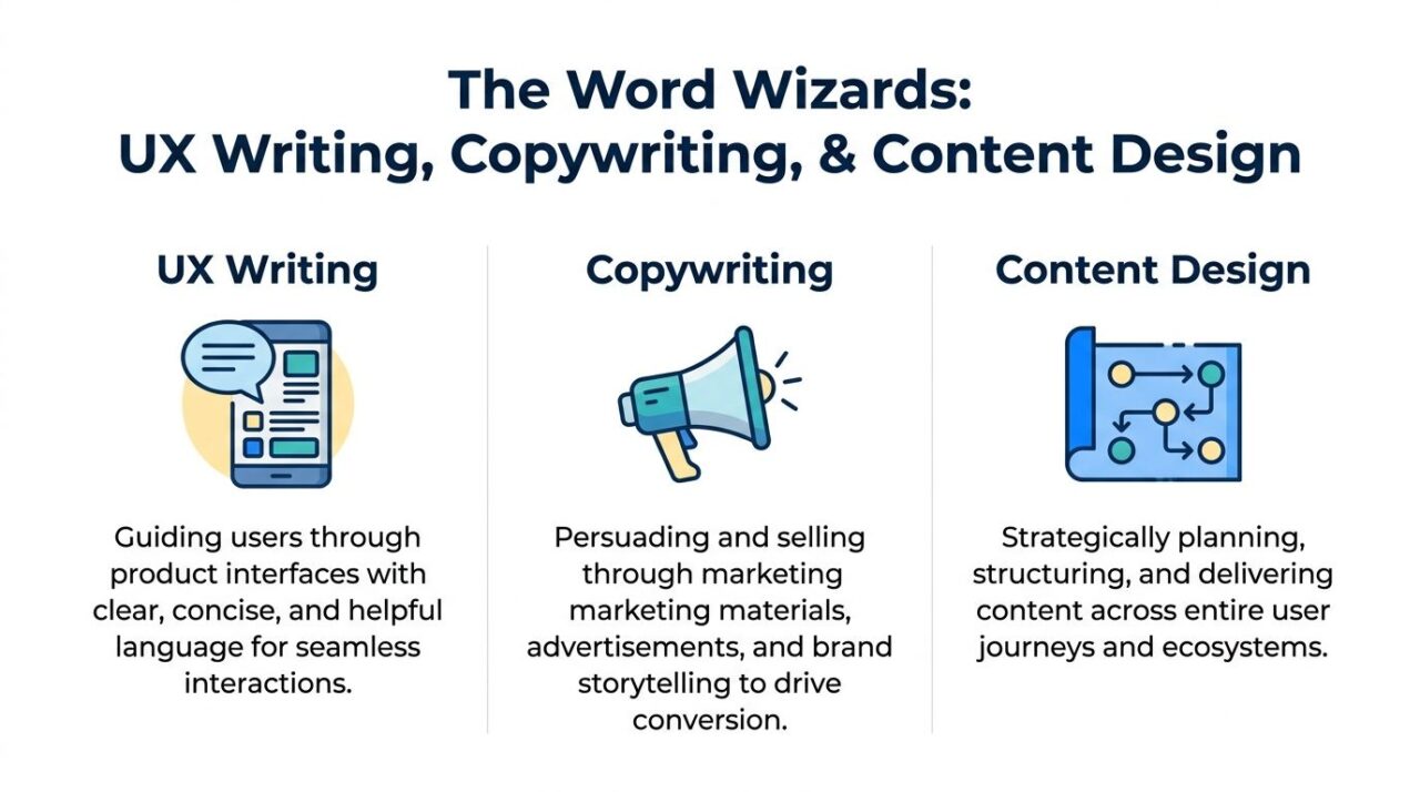
A copywriter persuades. A UX writer guides. A content designer shapes the broader content system across the whole journey.
That distinction matters because teams often assign the wrong problem to the wrong skill. If a landing page isn’t creating desire, that’s often copywriting. If checkout completion is weak because users feel uncertain, that’s usually UX writing. If the entire journey feels fragmented across site, app, email, support, and chatbot, content design is likely the missing layer.
UX Writing Content Strategy
The fastest way to separate the roles
Here’s the simplest breakdown I use with marketing teams.
| Discipline | Primary Goal | Example | Measures of Success |
|---|---|---|---|
| UX Writing | Help users complete tasks with less friction | Error message, checkout field hint, onboarding prompt | Task completion, lower confusion, smoother flow progression |
| Copywriting | Persuade users to take action | Ad headline, product page benefit statement, promo email | Conversion, click-through, response quality |
| Content Design | Plan and structure content across journeys | End-to-end onboarding flow, support architecture, multi-channel messaging system | Consistency, findability, user comprehension, journey coherence |
Where marketers get tripped up
Marketing teams often assume a good copywriter can handle all product language. Sometimes that’s true. Often it isn’t.
Persuasive writing and interface writing use different instincts.
A copywriter can make an offer sound compelling. A UX writer makes the next step feel obvious and low risk. Content design then ensures those moments connect cleanly across channels.
If you’re working on retention flows, it’s helpful to understand adjacent skills too. For example, understanding email marketing for online stores gives useful context on how promotional messaging works outside the product itself.
AI chatbots blur the line
In this context, the old distinctions start to bend.
The Interaction Design Foundation notes that many guides explain copywriting as persuasion and UX writing as utility, but they don’t fully address how that line blurs in AI chatbots, where writers must guide users while also simulating persuasive human conversation in marketing flows (AI chatbot nuance in UX writing).
That’s exactly what happens in Messenger, Instagram DM, WhatsApp, and on-site chat.
A chatbot for a skincare brand may need to:
- welcome the visitor in a natural tone
- ask a qualifying question
- recommend a product path
- handle objections
- recover drop-off
- close with a purchase CTA
That isn’t pure UX writing. It isn’t pure copywriting either.
It’s hybrid work. The message has to be usable enough to keep the flow moving and persuasive enough to sustain commercial intent. That’s why teams building automated conversations benefit from studying effective chatbot copywriting. It sits right in the overlap.
In chat, utility gets the user to the next message. Persuasion gives them a reason to care about it.
The mistake I see most is over-rotating toward one side. Pure sales language makes bots feel pushy. Pure utility makes them feel robotic. Strong conversational UX copy does both, in the right order.
Microcopy in Action: Real World Examples
Microcopy gets easier to understand when you see it working on actual interface moments.
The pattern is simple. Weak copy is usually vague, system-centered, or emotionally tone-deaf. Strong copy is specific, timely, and built around the user’s next question.
UX Writing Button Design
Buttons that reduce hesitation
A button label often carries more responsibility than teams realize.
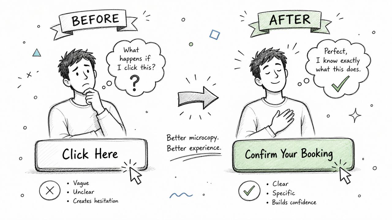
Before: Submit
After: Create My Account
“Submit” is generic. It sounds like paperwork. “Create My Account” confirms the action and outcome.
Before: Continue
After: Review Shipping Details
“Continue” makes the user guess. The revised version lowers uncertainty.
Errors that help instead of blame
This is one of the clearest markers of UX writing maturity.
Before: Invalid input
After: Enter a valid email address
The first message points at the user and offers no path forward. The second names the issue in usable language.
Before: Payment failed
After: We couldn’t process that card. Try a different card or check the card details and try again.
That extra line matters. In high-stakes moments, users need recovery instructions, not just status reporting.
For teams working inside apps, mobile flows, or hybrid products, insights for Capacitor teams offer a practical look at error handling from a UX perspective.
The best error message answers the question the user is already asking, which is usually “What do I do now?”
Chatbot prompts that sound human and still convert
DTC chatbots expose weak writing fast. A bot can have excellent logic and still underperform if the conversation feels stiff.
Before: Hello. How may I assist you today?
After: Looking for the right size, today’s offer, or help with your order?
The improved version narrows the choice and reflects common intent.
Before: Please provide your information.
After: Want me to send the discount code here?
The second version feels lower friction because it explains why the user should respond.
A few practical rewrites that tend to work better in marketing chat:
- Welcome message: Replace broad greetings with intent-based options.
- Lead qualification: Ask one easy question at a time. Don’t front-load a long form into chat.
- Cart recovery: Lead with relevance, not guilt. Remind the user what they were doing and give a direct path back.
- Post-purchase support: Confirm the status first, then offer the next likely action.
Why the better version works
When I review conversational flows, the strongest rewrites usually do one or more of these things:
- They reduce ambiguity: The user knows what clicking or replying will do.
- They acknowledge context: The language fits the moment, whether it’s signup, support, or checkout.
- They lower cognitive load: Fewer mental steps means fewer exits.
- They preserve momentum: The copy keeps users moving instead of making them stop and interpret.
That applies whether you’re editing a button in Figma or refining a chatbot flow in a no-code builder.
A Framework for Crafting High-Converting UX Copy
Most weak UX copy isn’t the result of bad writing. It’s the result of skipping the thinking that should happen before the writing.
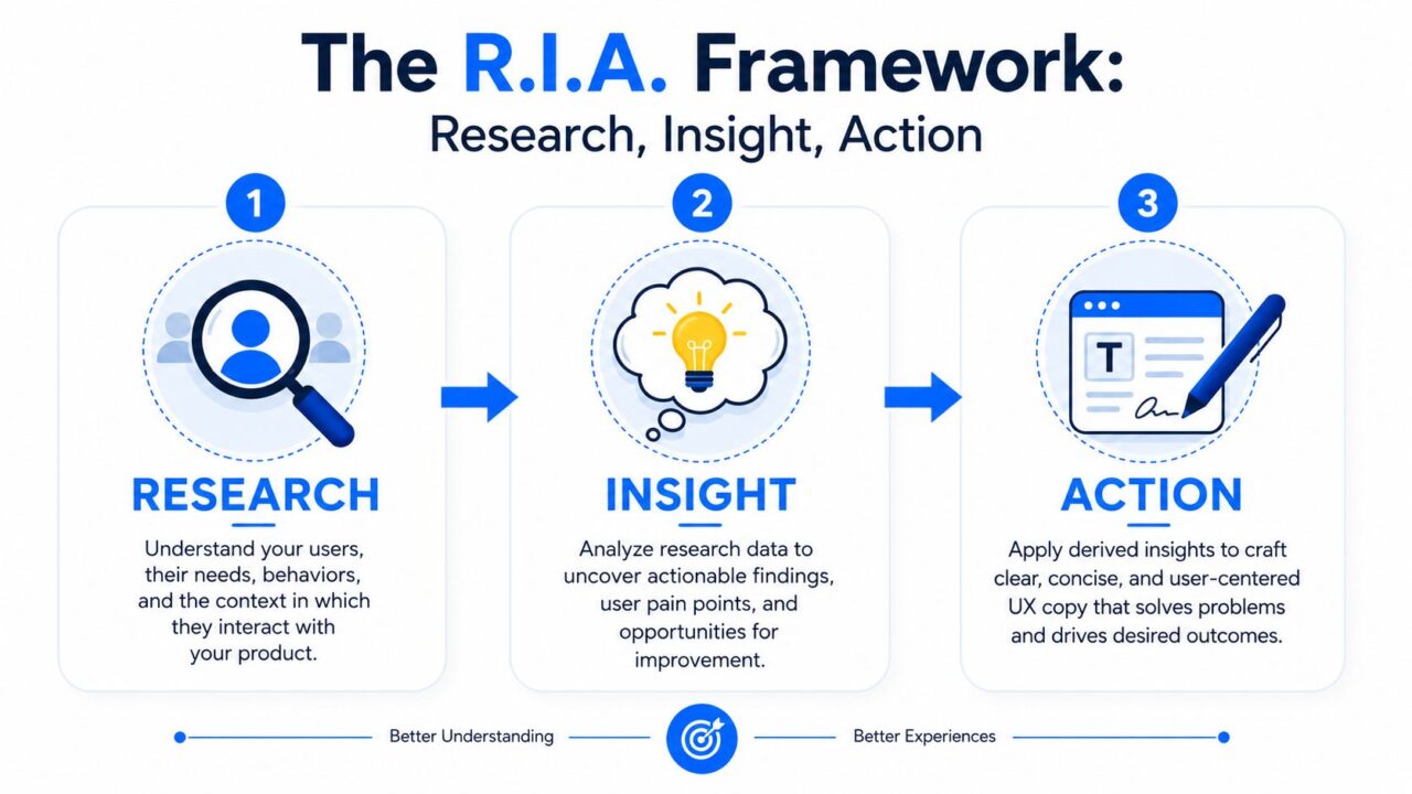
A simple framework keeps the work grounded: Research, Insight, Action.
UX Writing RIA Framework
The Fountain Institute describes the core of this process clearly: combine an observation, “I saw this,” with a root cause, “I know this,” to produce an insight. Strong insights also need to be desirable, viable, and feasible (structured insight framework for UX writing).
Research
Start by watching where people hesitate.
You don’t need a large research budget to improve copy. Review support tickets, live chat transcripts, session recordings, form drop-offs, and common objections from sales or CX teams. In chatbot flows, read actual conversations. The wording users choose tells you where their expectations and your interface don’t match.
Look for moments like:
- repeated clarification questions
- users abandoning after a specific message
- support requests caused by unclear instructions
- replies that don’t match the bot’s expected path
The job here isn’t to write yet. It’s to notice patterns.
Insight
Once you have the pattern, interpret it.
Observation alone isn’t enough. “Users stop at the shipping step” is not an insight. “Users stop at the shipping step because they don’t know delivery timing until too late in the process” is closer. It names both behavior and likely motivation.
A useful insight usually has tension in it:
- users want speed, but they fear making a mistake
- buyers want a discount, but they don’t want to feel trapped into messaging
- subscribers want help, but they don’t want to read a block of instructions
Good UX writing starts when you stop asking “What should this screen say?” and start asking “What uncertainty does this moment create?“
Action
Only now should you write.
Translate the insight into specific copy choices. If users fear hidden effort, add a time expectation. If they don’t trust what happens after clicking, make the CTA explicit. If they stall in chat, shorten the question and reduce the number of decisions in one message.
A practical action checklist:
- Name the moment: Signup, payment, recommendation, support, recovery.
- Define the user’s question: What are they trying to understand right now?
- Write one job for the copy: Explain, reassure, prompt, confirm, or recover.
- Draft multiple versions: Usually one direct, one warmer, one more concise.
- Check the three filters: Is it desirable for users, viable for the business, and feasible to ship now?
A chatbot example
Say a brand’s bot opens with: “Welcome to our store. How can we help?”
Research shows users often ignore it. Insight suggests the prompt is too open-ended for mobile chat. Action turns that into: “Need help with sizing, shipping, or today’s deal?”
That rewrite works because it narrows the task, reflects likely buyer intent, and makes responding easier.
The framework is simple, but it keeps copy tied to behavior instead of opinion. That’s what makes it repeatable.
Measuring Success and Testing Your Words
UX writing improves when teams treat copy like a product input, not a final polish pass.
That means testing it.
Typically, the best starting point is not a big research project. It’s a disciplined habit of measuring whether the words help people complete the task with less friction.

UX Writing Data Analysis
What to watch
The exact metric depends on the interaction.
For product flows, I usually look at:
- Task completion: Did users finish signup, checkout, onboarding, or support resolution?
- Time on task: Did they move through the step smoothly, or did wording slow them down?
- Confusion signals: Did they backtrack, pause, or trigger help requests?
- User feedback: What language shows up in complaints, chat logs, and support replies?
If you’re collecting customer input systematically, customer feedback methods can help teams build a tighter loop between user language and product copy.
How to test without overcomplicating it
A lot of meaningful tests are small.
Try comparing:
- one CTA label against another
- a short error message against a version with recovery guidance
- an open chatbot question against a structured prompt with reply options
- a formal confirmation message against a warmer one
The point isn’t to test every word in isolation. It’s to test whether the phrasing changes user behavior in the moment it appears. This is where ux research earns its keep in a digital product, since small wording shifts often reveal more about real behavior than a full redesign does.
One of the easiest wins in chatbot UX is reducing open-ended prompts. If users freeze when the bot asks broad questions, switch to specific choices and see whether response quality improves. Any ux designer working through this should treat it as part of the normal design process, not a one-off fix. Keeping the results documented in a shared style guide, alongside your broader content strategy and ui decisions, makes sure a phrasing win in the chatbot doesn’t stay isolated but actually shapes how the rest of the interface talks to people.
The role is expanding into AI training
UX writing becomes more interesting.
UX Content Collective notes that UX writing has grown beyond interface microcopy into work that shapes AI behavior, including refining prompts and structuring datasets so AI-generated content aligns with UX standards. The same source says 78% of product teams now integrate AI agents into their workflows (UX writing and AI agent workflows).
That shift matters because AI outputs often sound polished while still missing the point.
A generated error message may be grammatically clean but useless. A chatbot response may sound friendly but fail to move the user forward. UX writers are increasingly the people who define what “good” looks like, then encode it into prompts, examples, rules, and review criteria.
AI can generate text quickly. UX writers decide whether that text helps a real person finish a real task.
That’s not a side skill anymore. It’s becoming part of the craft.
Your UX Writing Toolkit and Career Path
If you’re asking what is UX writing because you want to build the skill, the good news is that it’s learnable. The better news is that the market treats it as serious product work.
Coursera reports that experienced UX writers in the US often earn median salaries ranging from $121,000 to $140,000, with strong demand for people who can write for conversational interfaces like chatbots (UX writer salary and role overview).
That salary range tells you something important. Companies don’t pay at that level for decorative copy. They pay for judgment.
The tools most teams actually use
The toolkit is less glamorous than people expect.
Most UX writers work across:
- Figma: For reviewing copy in interface context
- Spreadsheets or Airtable: For content inventories and message libraries
- Docs or Notion: For voice guidelines, decision logs, and drafts
- Research tools: For reviewing recordings, interviews, and support language
- Chatbot builders and CMS platforms: For testing live conversational and product experiences
But tools aren’t the hard part. The hard part is making the right call under constraints.
The skills that separate strong practitioners
The best UX writers I know share a few habits.
They can simplify without flattening meaning
Anyone can shorten copy. Strong UX writers keep the meaning intact while making the wording easier to act on.
They think in systems
A single message matters. So does consistency across signup, support, billing, and retention flows. Good practitioners spot where terms drift and trust erodes.
They write well in conversation
This matters more now because products increasingly speak back. Chatbots, AI assistants, onboarding flows, and support automations all require language that feels human without becoming vague.
They defend decisions with evidence
Taste doesn’t scale. Good UX writers point to user behavior, business goals, and product constraints.
A practical path into the field
If you’re a marketer, product designer, support lead, or copywriter, you don’t need to start from zero.
A solid progression looks like this:
- Audit one flow: Choose signup, checkout, onboarding, or chatbot lead capture.
- Rewrite the friction points: Focus on buttons, helper text, errors, confirmations, and prompts.
- Document your reasoning: What user uncertainty did each change address?
- Review with a team: Product, design, support, and marketing will all catch different issues.
- Test and refine: Treat every draft as a hypothesis.
That process builds the core muscle of UX writing. You’re learning to connect words with behavior.
The career upside is real, but the larger opportunity is broader. Teams need people who can make digital interactions clearer, calmer, and easier to complete. That’s what UX writers do. And in a market full of automated messaging, that skill only becomes more valuable when the conversation is happening inside the product.
If your team wants to apply UX writing inside chatbot funnels, support flows, and social messaging, Clepher is built for that kind of work. It gives marketers and operators a no-code way to design AI-powered conversations across website chat, Facebook, Messenger, WhatsApp, and Instagram DM, so you can turn better prompts, clearer paths, and stronger microcopy into real customer actions.
Related Posts
Client Account Management: A Practical Playbook
October 13, 2026Chat Bot Responses That Convert: A Practical Guide
October 12, 202610 Broadcast Automation Software Platforms Compared
October 11, 2026
Founder Clepher