
Only 10 of 500 popup campaigns, or 2.0%, used an exit-intent trigger in a 2026 analysis, while 477 campaigns, or 95.4%, appeared immediately on page load. That contrast changes how you should think about the format. An exit intent popup isn’t the default popup with a different label. It’s a specialized, late-stage intervention for visitors who appear ready to leave.
The more useful question isn’t whether exit intent popups work. It’s whether the page has already done enough to make the intervention worthwhile. Data from 83 Shopify stores found meaningful lift only when the underlying page converted at 2.3% or higher, while pages below 1.5% saw statistically negligible lift (RevenueFlows’ Shopify conversion analysis). That makes exit intent a backstop for healthy pages, not a rescue plan for weak offers.
What an Exit Intent Popup Actually Is
An exit intent popup is an overlay that appears when a visitor shows signs of leaving a website without completing the intended action. On desktop, the usual signal is the cursor moving toward the browser’s address bar, tab area, back button, or close control.
The popup might offer a coupon, remind someone about an unfinished cart, collect an email address, ask a survey question, or provide a useful guide. The format is still a modal. The differentiator is the trigger, not the visual design.
That separates exit intent from other popup behaviors:
- Page-load popups appear as soon as the page opens, often before the visitor understands the offer.
- Time-based popups wait for a defined period.
- Scroll-based popups respond to reading or browsing depth.
- Click-triggered popups open after a visitor selects a button, link, or other element.
- Exit-intent popups wait for a probable abandonment moment.
A commonly cited benchmark places average exit-intent popup conversion around 3.94%, while broader popup benchmarks sit near 4.82% across more than 1 billion displays (Popupsmart’s benchmark analysis). Treat that figure as a reference point, not a target you should chase blindly. A cart recovery campaign and a blog email capture campaign have different levels of intent, so their results shouldn’t be judged as if they were interchangeable.
Practical rule: The popup should answer the visitor’s likely objection at the moment they’re leaving.
For content marketers, an exit popup might extend the value of an article with a checklist or newsletter. If SMS is the better follow-up channel for your audience, the YipSMS guide to SMS sign ups offers useful context on designing a lower-friction subscription path.
The central operating principle is simple. Fix the page first, then use exit intent to recover visitors who were already close to taking action. If the offer is unclear or the checkout is broken, another overlay usually won’t solve the problem.
How Exit Intent Detection Works on Desktop and Mobile
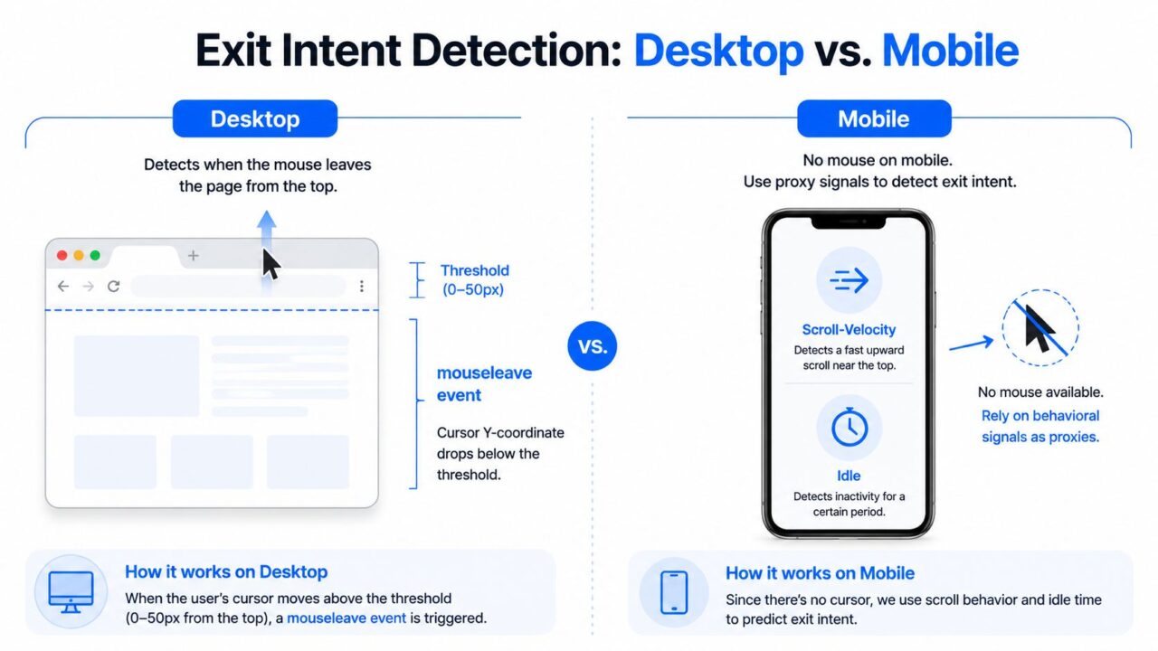
Desktop exit intent relies on a physical behavior that phones and tablets don’t have. A script watches for the pointer leaving the page through the top of the viewport, where a visitor may be moving toward the browser chrome.
A common implementation listens for mouseleave or mouseout, checks the cursor’s vertical position with event.clientY, and uses relatedTarget to distinguish a genuine departure from movement between page elements. A minimal version looks like this:
document.addEventListener("mouseleave", function (event) {
  if (event.clientY <= 0 && !event.relatedTarget) {
    showExitIntentPopup();
  }
});
Some teams use a wider threshold, such as the top 0 to 50 pixels, to catch movement before the pointer reaches the browser controls. The exact threshold should be tested against false positives. A narrow threshold may miss genuine exits, while a broad one can interrupt visitors who are still browsing.
The relatedTarget check matters because pointer events can fire while someone moves across nested elements. Without a guard, the popup may appear when the visitor hasn’t left the document.
Exit Intent Popup Detection Methods
Why the desktop rule fails on phones
Mobile browsers don’t expose an equivalent cursor-leaving signal. A visitor can’t move a mouse toward the address bar because there’s no mouse, so a desktop rule copied directly to mobile either does nothing or relies on a misleading substitute.
Mobile implementations commonly use proxy signals:
- Rapid upward scrolling, which can indicate a return toward browser navigation.
- Back-button intent, often handled through the History API.
- Idle time, especially after a visitor has reached a meaningful part of the page.
- Visibility changes, such as switching tabs or moving the browser out of focus.
- Low-engagement behavior, including reaching the page bottom without interacting.
No single signal reliably identifies abandonment. A fast upward swipe might mean a visitor is rereading a product detail, and an idle period might mean they’re comparing information elsewhere.
For implementation guidance on connecting visitor behavior to automation, see Clepher’s guide to tracking website visitors. In practice, use desktop mouseleave as the primary trigger. On mobile, combine one or two proxies, such as meaningful scroll depth plus idle behavior, rather than treating every upward movement as an exit.
When Exit Intent Popups Are Worth the Effort
The strongest argument against universal exit intent is the Shopify threshold. In the analysis of 83 Shopify stores, exit popups produced meaningful lift when the underlying product page already converted at 2.3% or higher. Below 1.5%, the lift was statistically negligible (RevenueFlows’ analysis of the conversion-rate myth).
That finding matches what experienced growth teams see in funnel reviews. A popup can catch a warm visitor who hesitates at the final step. It can’t repair a product page that doesn’t explain the product, a checkout that surprises shoppers with costs, or traffic that never matched the offer.
Audit these areas before adding another interruption:
- Headline clarity: Can a first-time visitor tell what you sell and why it matters?
- Above-the-fold offer: Are price, value, delivery information, and the next action visible quickly?
- Page performance: Do slow assets, scripts, or layout shifts make the page feel unreliable?
- Cart friction: Are forms, payment options, shipping details, and error states easy to understand?
- Traffic alignment: Does the landing page deliver what the ad, search result, or social post promised?
For cart-specific problems, use a broader recovery audit such as Clepher’s seven ways to reduce shopping cart abandonment before relying on a popup.
A simple decision rule
Turn on exit intent when the page already converts, visitors show clear commercial or content engagement, and you can present an offer that addresses a likely objection. Leave it off while the page is still failing to communicate value.
| Page CR before popup | Typical exit intent capture | Verdict |
|---|---|---|
| Below 1.5% | Statistically negligible lift | Fix the page before deploying |
| Around 2.3% or higher | Meaningful lift is more plausible | Test as a backstop |
| Healthy, high-intent page | Warm exits may be recoverable | Segment and measure incrementality |
The broader benchmark context supports that conditional view. Exit-intent campaigns average around 3.94% conversion, while cart-abandonment campaigns can reach 17.12% in benchmark coverage, and top A/B-tested campaigns have reached 26.83% (Flint’s exit-intent conversion statistics). The page and visitor state do most of the work.
Best Practices for Timing, Copy, and Design
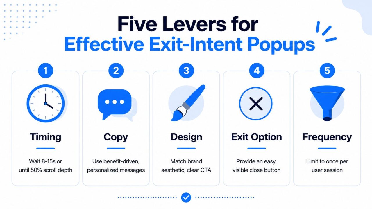
A popup earns attention when it appears late enough to feel relevant and gives the visitor one clear reason to act. Five levers control that experience: timing, copy, design, segmentation, and offer fit.
Exit Intent Popup Strategy Guide
Timing
Don’t show the modal to someone who has barely arrived. Start with 8 to 15 seconds of engaged reading or wait until the visitor reaches roughly 50% scroll depth, then combine that condition with the exit signal. A visitor who has read half a product page has given you more context than someone who bounced from the hero section.
For a short landing page, engagement may be better measured through interaction with pricing, FAQs, or a form. The point isn’t to use one universal timer. It’s to avoid spending the interruption on visitors who haven’t demonstrated interest.
Copy
Lead with one benefit-driven verb phrase:
- “Save 10% on your first order”
- “Get the cart-abandon checklist”
- “Send me the comparison guide”
Keep the subhead under 12 words and use one primary CTA. “Apply my 10% off” communicates the outcome more clearly than “Submit.” Don’t make the visitor decode the offer while they’re already trying to leave.
Design
Build the modal around a 600 by 400 pixel frame, leave 24 pixel padding, and use the brand font so the experience feels native to the site. Keep overlay darkness below 60% when you want the underlying page to remain visible, and give the close button a clear, accessible position.
Avoid decorative motion that delays comprehension. The visitor should understand the headline, offer, and CTA almost immediately.
Segmentation
Set a frequency cap of once per visitor per seven days for recurring campaigns. Suppress the popup for customers who converted in the past 30 days, and use a different message for logged-in users. A returning customer may need product support, loyalty messaging, or order information, not a first-order coupon.
Offer
Match the incentive to the funnel stage and economics. Use free shipping where delivery cost is the objection, a discount when price hesitation is credible, a content upgrade on a blog page, and a survey when the reason for abandonment is unclear. A high-margin product may tolerate a coupon. A low-margin product may need reassurance, saved-cart functionality, or human help instead.
A practical exit popup also needs an obvious close control and neutral opt-out language. You’re trying to recover a relationship, not punish someone for leaving.
Matching Triggers to the Right Page Type
An exit rule behaves differently on a cart, product, and blog page because each page represents a different visitor state. The trigger should therefore connect to the page’s main conversion metric, not just a generic popup submission.
| Page Type | Trigger Window | Offer | Headline Angle | Conversion Range |
|---|---|---|---|---|
| Cart | First genuine desktop exit attempt, after cart activity | Free shipping or a modest discount | Address hesitation and preserve the order | Use the relevant exit-intent benchmark as a reference, then establish a page-specific baseline |
| Product | After meaningful dwell or scroll engagement | Related product, reassurance, or stock information | Help the shopper decide | Measure against the product page’s existing add-to-cart behavior |
| Blog | After substantial reading engagement | Content upgrade or newsletter | Extend the value of the article | Compare email capture with the page’s organic signup baseline |
On cart pages, track recovered revenue per abandonment. A popup that collects emails but doesn’t recover orders may be useful for later nurturing, but it shouldn’t be called a cart-recovery success without revenue evidence.
Product pages need a different read. If the popup promotes a related item or answers a buying objection, watch the add-to-cart rate from sessions exposed to that message. A stock alert may suit a returning shopper, while a sizing guide may help a first-time visitor more than a discount.
Blog readers rarely need a purchase coupon as their first intervention. Offer the next useful asset instead, such as a checklist that directly expands the article. Measure email capture against the normal signup behavior for comparable organic traffic, and suppress the message for existing subscribers.
The most common reporting mistake is combining all three campaigns. A strong cart offer can make the overall popup dashboard look healthy while a poorly matched blog popup annoys readers. Keep page type, visitor state, offer, and outcome separate.
Metrics and Tests That Prove the Lift
A popup can report a high capture rate and still reduce profit. Track the numbers that connect the interaction to incremental business value, then use a control group to separate genuine lift from conversions that would have happened anyway.
The four metrics that matter
Capture rate tells you how many exposed visitors submitted the form or started the desired action. On a healthy page, a practical reference band is 3% to 5%. A result above 9% can signal an overly generous offer, weak qualification, or a campaign that’s targeting visitors who were already highly likely to convert.
Recovered revenue should include revenue from popup-driven sessions within seven days of capture, net of discount cost. For an email or SMS flow, define the attribution window before the test starts so you don’t change the rules after seeing the result.
Bounce delta compares page exit behavior before and after the popup launches. A healthy campaign may nudge bounce down by 2 to 4 points. If bounce rises, the modal is likely interrupting visitors who weren’t ready or creating an unpleasant mobile experience.
Incremental conversions are the conversions caused by the popup, not merely associated with it. Use a holdout group of 10% of eligible traffic to estimate the difference between exposure and no exposure (Clepher’s explanation of A/B testing in marketing).
| Metric | Healthy Range | Warning Sign | Minimum Sample per Arm |
|---|---|---|---|
| Capture rate | 3% to 5% | Above 9% may indicate over-incentivizing | 2,000 sessions |
| Recovered revenue | Positive after discount cost | Revenue is reported before incentive cost | 2,000 sessions |
| Bounce delta | Down 2 to 4 points | Bounce increases after launch | 2,000 sessions |
| Incremental conversions | Positive against control | Variant converts like or below control | 2,000 sessions |
Run a clean split
Inside Clepher, assign variant A to visitors who see the exit popup and variant B to visitors who don’t. Keep the page, traffic source, audience rules, and attribution window consistent across both arms.
Read the result after at least 2,000 sessions per arm, and stop only when the lift holds for three consecutive days. Then roll the winner into the default flow, document the audience and offer, and schedule a later review. A campaign that wins only because of a short-lived promotion shouldn’t become a permanent site behavior.
Copy Templates You Can Steal Today
The best exit popup copy doesn’t dramatize the departure. It states what the visitor can get and makes the next step obvious.
For blog readers
Headline: Before you go, want the full checklist?
Subhead: Get the practical steps delivered to your inbox.
CTA: Send it to me
Use this on a content page when the visitor has read enough to understand the subject. The deliverable should extend the specific article, not introduce an unrelated newsletter. Reuse the same headline and benefit in the follow-up email so the visitor recognizes the message immediately.
For cart abandoners
Headline: Still deciding on your order?
Subhead: Apply 10% off before you leave.
CTA: Apply my 10% off
This fits shoppers who have added a product and appear to be hesitating over price. Use it only when your margins allow the discount and the cart behavior shows genuine intent. Include the offer terms clearly, and repeat the exact discount language in the cart-recovery follow-up.
For exit research
Headline: What stopped you?
Subhead: Answer one question to help us improve.
CTA: Tell us
A survey works when the team doesn’t know why visitors leave and needs better qualitative evidence. Keep the question optional and avoid turning the survey into a disguised sales pitch. Feed common responses into product-page, shipping, pricing, or checkout tests.
Avoid guilt-based decline copy such as “No thanks, I’d rather pay full price.” “Not right now” is clearer, calmer, and less likely to make the visitor feel manipulated.
Building Exit Intent Flows Inside Clepher
A static coupon popup is only one way to respond to an abandoning visitor. A conversational flow can first identify what’s blocking the decision, then route the visitor toward help, an incentive, or a human response.
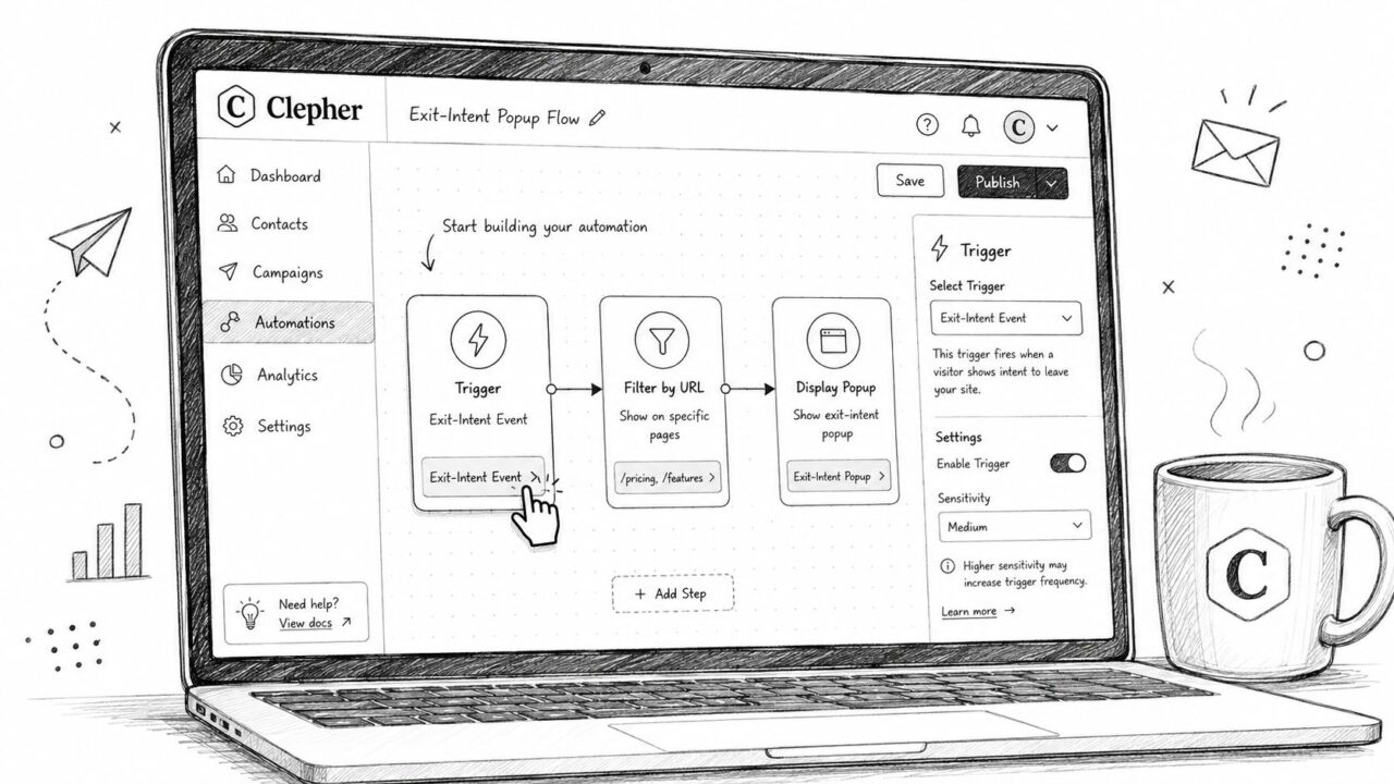
Start by setting the trigger to the exit-intent event. Use desktop mouseleave detection, then select a mobile proxy such as scroll velocity or idle behavior where appropriate. Add filters for page URL and visitor state, including whether the visitor has a cart, whether they’re a first-time visitor, and whether they’ve already converted.
Exit Intent Popup Dashboard Interface
Build the conversational branch
Open with a short question rather than an automatic discount:
Still deciding on the blue or the black?
The answer can determine the next step. A shopper asking about fit should receive help or a sizing resource. Someone hesitating over price may receive a small incentive if the campaign rules permit it. A detailed question should hand off to a human instead of forcing the visitor through a rigid bot path.
For teams that need structured responses, a tool to build custom data collection workflows can help organize survey answers, qualification fields, and follow-up routing without adding unnecessary fields to the first interaction.
Add the follow-up
If the visitor submits an email or abandons the chat midway, send the cart-recovery message within 30 to 60 minutes. Reuse the same offer, wording, and product context from the popup so the follow-up feels like a continuation rather than a new campaign.
Finish with suppression rules. Cap frequency, stop the flow after conversion, and exclude visitors who already received the same incentive. Then review recovered revenue in the Clepher dashboard, separating chatbot-assisted orders from ordinary abandoned-cart activity.
Clepher lets you build exit-triggered conversational Flows that qualify hesitation, offer help or an incentive, and continue the conversation through follow-up broadcasts. Visit Clepher to connect an exit intent popup with cart recovery, segmentation, and measurable automation instead of relying on a static discount alone.