
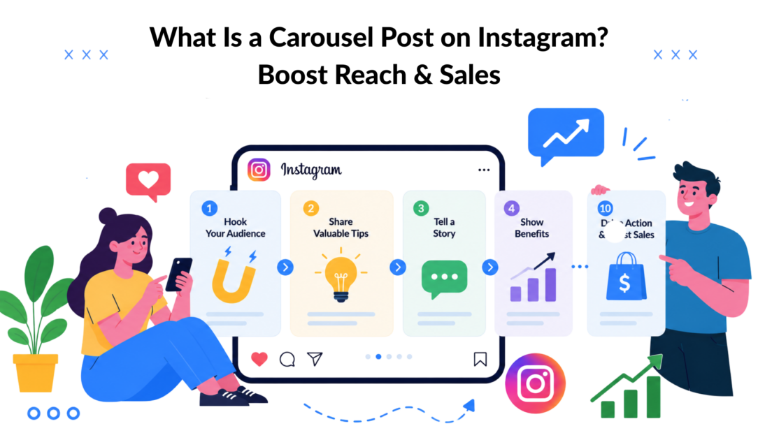
An Instagram carousel post is a single feed post that contains multiple photos or videos users can swipe through, with up to 10 slides in one post. It matters because carousel posts average 1.92% engagement, higher than single images at 1.74% and videos at 1.45%, with mixed image-and-video carousels reaching 2.33%.
That’s why the question isn’t just what a carousel post is on Instagram. The better question is why so many strong-performing brand posts now use this format when they need attention, saves, and a clearer path to conversion.
A carousel gives you more than one chance to make the point. You can teach, compare, reveal, demonstrate, and handle objections without asking people to leave the feed. For a marketing manager, that makes it one of the cleanest content formats for moving someone from passive scrolling to active interest.
What Is an Instagram Carousel and Why Should You Care
A carousel post is a swipeable Instagram feed post made up of multiple images, multiple videos, or a mix of both. Instead of forcing one asset to do all the work, the format lets you build a sequence.
That sequence is the key advantage.
Carousel posts average 1.92% engagement, compared with 1.74% for single images and 1.45% for videos, and mixed carousels reach 2.33% on average according to Publer’s Instagram carousel stats roundup. For marketers, that gap matters because engagement usually means people didn’t just notice the post. They spent time with it.
Why marketers lean on carousels
A carousel works when one static image would oversimplify the message. Think about these common use cases:
- Product education: Show the problem, the feature, the result, and the proof in one post.
- Lead generation: Teach something useful, then invite the viewer to take the next step.
- Objection handling: Use later slides to answer the questions a buyer would normally ask in comments or DMs.
- Storytelling: Walk through a transformation, a process, or a before-and-after sequence.
Practical rule: If the post needs context to persuade, a carousel usually beats a single image.
This is especially useful in social media marketing for small businesses, where every post has to do more than look good. Small teams often need one asset to educate, build trust, and create action. A carousel can do all three if the sequence is structured well.
The mistake I see most often is treating a carousel like a folder dump. Ten slides don’t help if the audience loses interest after the first one. Strong carousel content has a job on every slide.
If your team is refining its creative process, this guide on creating quality Instagram content is a useful companion because the same principle applies here. Better inputs produce better post performance.
The Unbeatable Benefits of Carousel Posts
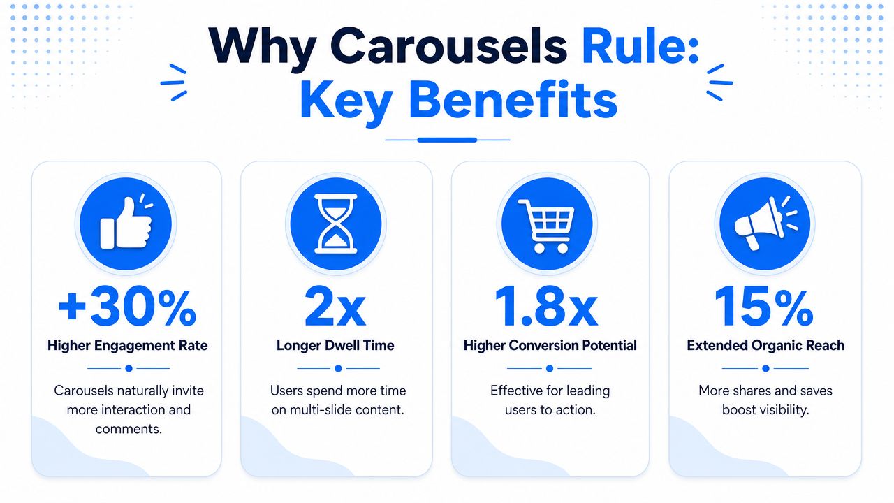
Instagram has already signaled where it puts value. The platform officially confirmed that carousel posts can generate more reach and engagement, and it introduced a behavior where the second image of a carousel can resurface to users who didn’t interact the first time, giving the post a second chance to connect, as explained in Jenn’s Trends’ breakdown of Instagram’s confirmation.
That one detail changes how you should think about the format. A carousel isn’t just a post type. It’s a post type with more room for recovery.
Carousel Post on Instagram Benefits
Why this format keeps winning
Here’s what carousel posts do better than most brands expect.
- They earn more attention over time: Because Instagram may show the second slide again to non-engagers, a carousel has another shot at catching interest after the first pass.
- They hold context inside the post: You can explain a feature, walk through steps, compare options, or answer objections without relying on a long caption alone.
- They support stronger saves: Carousels tend to work well for educational content, checklists, comparisons, and tutorials because people can return to them later.
- They fit the middle of the funnel: Reels are great when you want discovery. Carousels are stronger when you need understanding.
What that means for business results
If you manage e-commerce, DTC, SaaS, or service marketing, a carousel gives you room to guide a buyer from curiosity to intent in one feed asset.
A few practical examples:
| Use case | How the carousel helps |
|---|---|
| Product launch | Slide 1 hooks interest, middle slides show features, final slides handle objections |
| Service business | Slides can unpack a process, a deliverable, and what the outcome looks like |
| Education marketing | A mini lesson builds trust before the CTA |
| Client-facing agency content | Side-by-side comparisons and step sequences are easier to understand in swipe format |
Carousels work best when the message needs progression, not just decoration.
What doesn’t work is padding the post with repetitive slides. If slide 4 says the same thing as slide 2, the post gets heavier without getting clearer. Reach may start the conversation, but clarity is what gets people to act.
Key Carousel Formats and Technical Specs
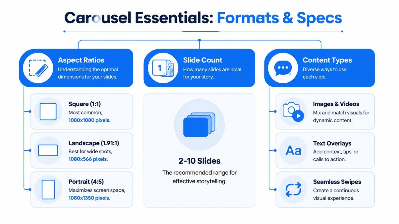
Before you plan the story, get the build right. Instagram applies one important rule to carousel formatting. The first uploaded slide determines the aspect ratio for the entire post, and the platform supports 1080×1080, 1080×1350, and 1080×608, with a maximum of 10 slides, according to Contentdrips’ summary of Instagram carousel size and format rules.
That means you can’t casually mix a portrait slide with a square one and expect it to display cleanly. The first frame sets the container.
Carousel Post on Instagram Specs
The technical rules that matter
Use this as your basic production checklist:
- Choose the ratio first: Decide whether the post should be square, portrait, or horizontal before design starts.
- Keep all slides consistent: Once the first slide is uploaded, every slide follows that same ratio.
- Design for readability: Small text that looks fine in a desktop design file often becomes hard to read on a phone.
- Use slide count intentionally: Don’t fill the post just because the slots exist.
Carousel formats that work in practice
The best carousel format depends on what you’re trying to get the audience to understand.
Tutorial sequence
This is the classic educational carousel. Each slide moves the reader through one step, one mistake, or one decision.
Example: A skincare brand can use slide 1 for “Why your routine isn’t working,” then use the next slides to explain order of application, ingredients to avoid mixing, and the final routine.
Before-and-after transformation
This format performs well when the result is visible and believable. The key is to explain what changed, not just show the final image.
Example: A fitness coach can show the initial issue, the process, and the improved outcome. A home service company can show the original space, the work completed, and the final finish.
Product showcase
This works when buyers need more than one angle or context to make a decision.
Example: A DTC brand can use one carousel to show packaging, materials, feature close-ups, size context, and usage scenarios. That reduces friction because the viewer doesn’t have to hunt through older posts.
Data or insight breakdown
This is useful for agencies, consultants, and B2B brands that sell expertise.
Example: A paid social agency can turn one client lesson into a sequence. Slide 1 states the issue, slides 2 through 7 unpack the diagnosis, and the final slide invites discussion.
Use carousels when your audience needs to follow a line of thought. Use single images when one visual can carry the whole message. Brands that use Instagram carousel posts for this kind of breakdown tend to see people spend longer on the content, since each slide asks for one more swipe rather than one glance and move on.
Whether you rely on images or videos within the sequence, the goal of carousels on Instagram is the same: keep someone engaged long enough to absorb the full argument, not just the headline.
One more trade-off. Portrait usually gives you more screen presence in the feed, but it also leaves less room for cramped layouts. If your design team loves dense slides, square can be safer. If your team writes tight copy and wants stronger visual presence, portrait usually wins. Either way, if the goal is to boost engagement and lift engagement rate, learning to create Instagram carousel content well matters more than picking the “perfect” format, since a well-paced sequence will outperform a beautifully formatted one that loses people on slide three.
How to Create Carousels That Stop the Scroll and Drive Swipes
A good carousel doesn’t just get opened. It gets completed. That’s a different skill.
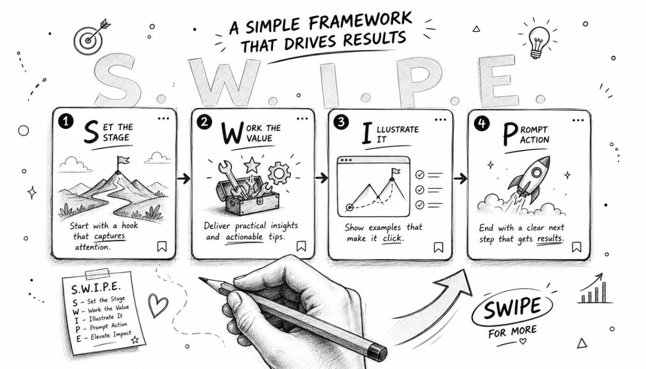
The strongest structure I’ve seen for educational and conversion-oriented carousels is the S.W.I.P.E. method: Strong Hook on slide 1, Why It Matters on slide 2, Inform on slides 3 to 7, Provide Summary on slide 8, and End with CTA on slides 9 to 10, based on the Instagram post outlining the S.W.I.P.E. framework.
Carousel Post on Instagram SWIPE Framework
Build the post like a sequence, not a stack
A carousel loses people when each slide feels isolated. The audience needs a reason to keep going.
Here’s what each part of the framework should do:
-
Strong Hook
Open with a statement, tension point, or promise that’s specific. “Instagram tips” is weak. “Why your carousel loses people after slide 1” is stronger. -
Why It Matters
Slide 2 should answer the silent question in the viewer’s mind. Why should they care enough to keep swiping? -
Inform
This is the body. Teach one point per slide. Don’t crowd several ideas onto one graphic. -
Provide Summary
Bring the lesson together. If someone skimmed the middle, the summary should still make the point land. -
End with CTA
Tell the viewer what to do next. Save, comment, DM, click, reply, or share.
Protect swipe momentum
One underused idea in carousel strategy is swipe momentum. If people stop after slide 1, the post usually underperforms. The best carousels create a visible thread from one card to the next.
That means:
- Use directional cues: Arrows, cropped layouts, or partial reveals can signal continuation.
- Write open loops: Let one slide create a question the next slide answers.
- Make slide 2 count: It shouldn’t repeat slide 1. It should reward the swipe.
If slide 2 feels obvious, viewers leave. If slide 2 delivers value, they keep going.
A simple “Swipe Left” overlay on the first or second slide can help guide behavior, especially for audiences that don’t regularly engage with educational carousel content. It sounds basic, but explicit direction often beats clever design.
For teams building mission-driven or community-oriented content, this guide for church social media outreach is a good example of adapting carousel structure to an audience that needs clarity and warmth more than flashy visuals.
A few tactical habits separate solid carousel teams from inconsistent ones:
- Write the hook last: Once the body is clear, you can write a better opening.
- Keep one promise per post: Trying to educate, entertain, sell, and inspire in the same carousel usually weakens all four.
- Design for mobile first: Test every slide on a phone before publishing.
- End with a real CTA: “Thoughts?” is weaker than “DM us the word GUIDE for the checklist.”
This breakdown is also useful if you want to sharpen the fundamentals of Instagram growth tactics and posting strategy.
Measuring Carousel Success and Optimizing Performance
Many teams look at likes first. That’s understandable, but it’s not enough.
Carousel performance gets clearer when you watch what happens after the first slide. One useful principle is that the second slide creates double the engagement opportunity because swiping itself counts as algorithmic engagement, which can help Instagram distribute the post more widely, as described in Nicola Washington’s explanation of when to use a carousel versus a reel.
What to review inside Instagram Insights
Focus on signals that tell you whether the carousel held attention.
- Reach: Did the post get seen beyond your most engaged followers?
- Saves: Educational and reference-style carousels should usually aim to earn saves.
- Shares: If people forward the post, the topic and framing probably have practical value.
- Comments: Useful for understanding what people still didn’t understand, or what they want next.
How to diagnose a weak carousel
A low-performing carousel usually fails in one of three places:
| Symptom | Likely issue | Fix |
|---|---|---|
| Good reach, weak engagement | The hook got attention, but the sequence didn’t pay it off | Rewrite slide 2 and tighten the body |
| Some likes, few saves | The post was interesting but not useful enough to revisit | Add clearer takeaways or a checklist format |
| People comment with questions already answered in the post | Slides are too dense, or the logic jumps | Simplify copy and improve slide order |
Watch where curiosity drops. That’s usually where the creative needs work.
A simple testing routine helps. Change one variable at a time. Test a sharper first-slide hook against a softer one. Compare a tutorial format with a myth-versus-fact format. Try a direct CTA on the last slide versus a softer educational close.
If you work in a vertical where trust and consistency matter, these social media engagement strategies for real estate show how format choices can shape audience response over time.
The main point is this. Don’t judge a carousel only by whether people liked it. Judge it by whether people moved through it, saved it, shared it, and acted on it.
Turn Carousel Engagement into Customers with DM Automation
A carousel earns attention. The next job is capturing intent while it’s fresh.
The cleanest way to do that is to end the carousel with a CTA that invites a direct message. Instead of hoping the viewer remembers your link in bio later, you ask for an action inside Instagram. Examples include “DM us ‘CHECKLIST’ for the full guide” or “Send ‘DEMO’ if you want the template.”
That shift matters because it turns passive engagement into a conversation. Remember that an Instagram carousel is a post first, so it still competes for attention in a crowded feed, which is exactly why the DM-trigger CTA works so well as the close.
If you’re producing these regularly, it helps to build a small set of Instagram carousel post templates so the structure doesn’t have to be reinvented each time, then schedule Instagram content around your posting cadence rather than publishing reactively.
Most scheduling tools let you queue carousel posts in advance, which keeps the DM-trigger habit consistent instead of something you only remember to add occasionally. The same close works for a carousel ad, too, since a paid post with a “DM to claim” prompt can route cold traffic straight into a conversation instead of a landing page.
Carousel Post on Instagram Clepher Marketing
What a practical conversion flow looks like
A strong carousel-to-DM system usually follows this path:
-
Hook the right audience
The carousel teaches something specific enough to attract qualified interest. -
Offer a clear next step
The final slide asks the viewer to send a keyword for a resource, offer, booking link, or next-step message. -
Reply instantly
Automation sends the promised item right away, while interest is still high. -
Continue the conversation
The follow-up can qualify the lead, answer common questions, or route the person to sales or support.
Why this works better than a passive CTA
“Link in bio” creates friction. A DM CTA reduces it.
For e-commerce, that might mean sending a size guide, restock alert, or product recommendation. For a coach, it might mean delivering a worksheet or mini training. For an agency, it might mean sending an audit intake or service explainer.
The key is alignment. The lead magnet or offer needs to match the promise made in the carousel. If the post teaches “3 mistakes in your ad creative,” the DM should continue that topic. Don’t bait with education and switch to a generic sales pitch.
You can also tailor the CTA to post intent:
- Educational carousel: “DM GUIDE for the full version”
- Product carousel: “DM SAMPLE to see options”
- Service carousel: “DM AUDIT to start the review”
- Event carousel: “DM RSVP for details”
If you want to automate that handoff inside Instagram, this guide to Instagram DM automation shows how teams turn content engagement into lead capture and follow-up without relying on manual replies.
The win isn’t just convenience. It’s speed. When the post creates interest and the inbox responds immediately, more viewers become contacts, and more contacts become qualified opportunities.
Clepher helps businesses turn Instagram engagement into real conversations with AI-powered DM automation, no-code Flows, audience segmentation, and fast follow-up across Instagram, Messenger, WhatsApp, and more. If you want your carousel posts to do more than collect likes, explore Clepher.

Related Posts
Chat Bot Responses That Convert: A Practical Guide
October 12, 202610 Broadcast Automation Software Platforms Compared
October 11, 2026Customer Journey Automation: The Practical Guide
October 10, 2026
Founder Clepher